The calculated thickness is a useful metric, it allows some diagnosis of whether PIOMAS volume changes are due to changes in area or thickness, and changes in its annual cycle reflect changes that PIOMAS volume suggests are significant. But can the calculated thickness metric be used to say anything about real thickness on the ice pack?

Figure 4, figure 2 of Kwok & Rothrock 2009.
Figure 4 shows ice thickness obtained from upward looking submarine sonar (1988) and ICESat retrievals (2004-2008), in the Data Release Area (DRA) which covers the central Arctic off the Canadian Arctic Archipelago (CAA), more. Between those periods the sea ice thickness dropped substantially. In the Physics Today article from Kwok & Untersteiner there is a graphic perhaps better suited for seeing the drop.

Figure 5, figure 3 of Kwok & Untersteiner.
EDIT BEGINS
From this it can be seen that while there is a large drop between 1988 and the ICESat data, just under 1 metre, there is a further massive loss of around 0.75 meters during the ICESat mission (2004-2008). How does that compare with the PIOMAS calculated thickness? Figure 3 (see below) does show the changes in a qualitative sense, a drop between the 1980s and 1990s, with a larger drop between 2004 and 2007, however there is actually an increase in 2008 despite ICESat showing a substantial drop.

Figure 3, from previous post, 1979 to 2012 timeseries of calculated thickness using extent and area. Original size here.
Schweiger et al carried out validation against Kwok and Rothrock's work finding that in Autumn PIOMAS, using ice concentration and sea surface temperature assimilation, had a trend of -0.38m/decade, whereas Kwok & Rothrock had a trend of -0.50m/decade. However this validation was in the DRA and outside of that region there has been a lot of thinning of thick ice off the CAA (PIOMAS underestimates thick ice), while in the Siberian sector there has been an unknown change of what has always been relatively younger, hence thinner, ice due to the divergent effect of the transpolar drift (and PIOMAS overestimates the thickness of thin ice). So perhaps the discrepancy can be explained at least in a qualitative sense, indeed Schweiger et al conclude as much with respect to thickness trends.
Furthermore Schweiger et al carry out three runs with PIOMAS; the main one they concentrate on is that which assimilates both sea-ice concentration (IC) and Hadley sea surface temperature (SST), they also carry out runs without any assimilation and assimilating only sea-ice concentration. Within the DRA the latter two runs have substantially larger trends that more closely match Kwok's findings. So as noted by Schweiger the assimilation of both SST and IC produces a conservative result, and it's that version that's available at the PIOMAS website.
The following is from figure 6 of Schweiger et al:

From the spreadsheet I'm using the calculated average thicknesses are 1.75m for Feb & Mar 2004-2008 and 1.65m for Oct & Nov 2003-2007. These figures are in reasonable agreement with the PIOMAS results shown above, and the rest of figure 6, and text, shows that the PIOMAS result is somewhat thinner than the ICESat thickness fields for the same periods. So PIOMAS is producing reasonable fidelity to thickness. There's a paywall free copy of Schwieger et al at the end of this post.
However if we look at the PIOMAS thickness for the dates of the area minima of each year we get a larger thickness than may be expected.
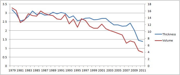
Figure 6, PIOMAS volume and thickness calculated from area at the annual minima dates for sea-ice area 1979 to 2011. Left axis is thickness, right is volume (1000km^3).
In Kwok & Untersteiner the thickness loss between 1980 and 2000 is around 1 metre. Over the same period the calculated thickness loss is around 0.5m. This is probably because when the sea-ice is at its minima, particularly in recent years, its thickness is biassed upwards by the thicker ice off the CAA, which occupies a proportionately larger surface area as the overall Arctic sea-ice area decreases. This is probably the main reason for the lack of thinning in figure 3.
EDIT ENDS
After 2008 figure 3 shows a significant drop in calculated thickness for both area and extent. Over this period there are no published widespread observations. We are left with small scale snapshots, such as the Alfred Wegener Institute (AWI) flights, which show substantial losses of thickness over the CAA, more. This observation could be construed as part of the process of rapid thinning of thicker ice. CRYOSAT's initial release image at the Paris Airshow seems to be overly thick (around 3m thick in February) given the past observations from the DRA and ICESat. Although I understand* that that image was pre-validation and that the Alfred Wegener Institute flights were part of the Crysat validation effort. Validation being the cross checking of a new measurement system with measurements carried out using existing tried and tested methods. *I can't find the link for the source at present.
What then does all this mean for the recent massive volume loss suggested by PIOMAS and the thickness implications of that loss when viewed from the areal minima of recent years? We lack direct observations precisely when they are most needed. Cryosat is the only largescale option and it's initial unvalidated results do not agree with the DRA data, ICESat and the Alfred Wegener Institute flights: If Cryosat is correct then the sea-ice has gained substantially in thickness and the PIOMAS trend and behaviour of the ice pack suggest that this is not the case. So at present all we have is PIOMAS, and we know that interpreting that in a quantitative sense needs to be approached with caution. However if, as Schweiger et al advise regarding thickness, we resort to a qualitative assessment the results are difficult as well. Thickness calculated at minima suggests a further loss of almost a meter in the years after Kwok's ICESat results. Proportionately bringing the 1m thickness during Autumn at the end of ICESat down to a figure substantially less than 1m,
Furthermore there is the issue that in 2008 there is an uptick in calculated PIOMAS thickness, while ICESat shows a drop. As I have been arguing about the significance of 2 years, actually 2010 followed by aftermath in 2011, such a significant 1 year deviation between PIOMAS and ICESat needs to be addressed. It is significant that the volume anomaly for 2008 is relatively flat, and that the uptick is strongest in area calculated thickness, extent calculated thickness being unremarkable. Neven shows that 2008 was a year with high levels of surface melt ponds, and area calculations are prone to reading surface melt as open ocean, with a low area and steady volume implying an increase in thickness to 'compensate': Such a false reduction in area due to melt ponds could easily account for the uptick in 2008's area calculated extent.
With regards the massive volume loss in the last two Springs, 2010 & 2011: PIOMAS shows substantial negative volume anomalies, these are supported by the change in the seasonal calculated thickness cycle. Whilst calculated thickness may not be able to tell us about regional thickness it can tell us whether volume changes are accounted for by change in area/extent or implied thickness, and the recent Spring volume losses cannot be accounted for by changes in area/extent. So it seems reasonable to conclude that the volume losses of the last two years are a due to thinning of the ice pack, not an area loss. As argued previously, the loss of volume in Spring 2010 seems to be associated with weather conducive to melt. However as far as I can see this does not seem to be the case with 2011, which begs the question; why was there volume loss in Spring 2011?
Which brings me to my closing point on this matter.
Over at Neven's Sea Ice Blog, a graph was posted yesterday, see the coloured graph, second down, click on it to enlarge. The graph is by Wipneus and shows the expected volume (based on extrapolation of an exponential fit) for each day of the last 2 years, and 2012 so far. Looking at 2010 it is clear that the deviation below the expected volume begins in Spring 2010, which is what I've been arguing. 2011 shows that the deviation below the expected trend continues from 2010 through the Winter and persists until the volume minima, after which the volume catches up with the trend. 2012 so far shows the volume running above the expected, with the difference between the two closing.
I still don't like extrapolation to zero, even Maslowski in his extrapolation to zero trends still indicates an unknown amount of sea-ice surviving, pdf. However for the purposes of this argument I'll put aside my doubts and use the exponential trend: If we take the trend that Wipneus is extrapolating from as the trend due to the process's involved in the long term loss of volume, then we may be able to see if the volume loss of 2010 is an unrelated 'blip' due to weather forcing, with 2010 being its aftermath.
What I'm thinking is this:
1) 2012 does not see substantial Spring volume losses - this means 2010's volume loss was a 'blip' and we're still on trend. Which means I'll be veering back to my opinion that the extrapolation of trend to zero isn't strong evidence of a seasonally sea-ice free state this decade.
2) 2012 does see substantial Spring volume losses - this means while 2010 was volume driven it has tipped the sea-ice into a new faster trajectory. i.e. something radical and significant is now happening in the Spring which hasn't happened before, and this has put us on a new more rapid downward volume trajectory.
Obviously if Summer 2012 were to see a repeat of the weather of 2007 accompanied by massive volume losses that would not support option 2, it would just be another extraneous factor as in option 1. Although as the Arctic Dipole seems to have had a hand in both 2010 and 2007, whether or not such events are extraneous to the process of Arctic climate change is dubious, that said it would not mean a new factor was at play losing volume in Spring.
Now it's just a matter of waiting to see what this Spring brings.
PS.
While coming home on the bus tonight a thought struck me - from the above it could be taken that PIOMAS only assimilates IC & SST. To be clear I quote from Schweiger et al:
"Daily mean NCEP/NCAR reanalysis data are used as atmospheric forcing, i.e., 10-m surface winds, 2-m surface air temperature (SAT), specific humidity, precipitation, evaporation, downwelling longwave radiation, sea level pressure, and cloud fraction. Cloud fraction is used to calculate downwelling shortwave radiation following Parkinson and Washington [1979]."
So whilst the input of sea-ice observations is limited to SST and IC, the observed behaviour of the atmosphere is included by default, this is why I see the observations of 2010 and 2011 as important an real.
Data sources:
PIOMAS Volume.
http://psc.apl.washington.edu/wordpress/research/projects/arctic-sea-ice-volume-anomaly/
CT Area.
http://arctic.atmos.uiuc.edu/cryosphere/timeseries.anom.1979-2008
Crandles Extent.
https://docs.google.com/spreadsheet/ccc?key=0AjpGniYbi4andElTczhVS2t2VW5Ka0sySnFrcndTTkE#gid=0
Papers:
Kwok & Rothrock, 2009, Kwok & Rothrock, 2009, "Decline in Arctic sea ice thickness from submarine and ICESat records: 1958–2008." GRL.
http://rkwok.jpl.nasa.gov/publications/Kwok.2009.GRL.pdf
Kwok & Untersteiner, 2011, article from Physics Today.
http://rkwok.jpl.nasa.gov/publications/Kwok.2011.PTO.pdf
Schweiger et al, 2011, Uncertainty in modeled Arctic sea ice volume.
http://psc.apl.washington.edu/wordpress/wp-content/uploads/schweiger/pubs/IceVolume-2011-06-02-accepted-with-figures.pdf
14 comments:
Chris, It's an interesting race. We see large gains in extent/area during one of the warmest of arctic winters. One would suppose, then, that the ice is thin and preconditioned for early melt. Yet we have to always keep in the back of our minds that weather still plays a significant role in any given year.
I'll be interested to see if this melt season follows the patterns of past years. I benchmark certain points - usually the various 'million sq km' points because they're easy to keep track of and percentages of maximums (extent and/or area).
The Atlantic sector appears so weak that I'm especially interested to see what defenses the arctic has left at its disposal. In the Pacific sector we see MYI pushed into the Transpolar Drift and thrown up like an arm across the Beaufort Gyre to ward off the increasing warmth. Is there a trick to keeping the Atlantic sector safe that we haven't seen yet? Perhaps banks of fog to keep insolation from reaching the surface .... it's all speculation at this point, but in another 45 - 60 days we'll have the early data telling us what we might expect come fall.
From what I've read the correlation between Winter conditions and the September minimum isn't strong.
Bitz "On the maintenance of the sea ice edge" shows that in the Atlantic sector there is a net heat flux (ocean & solar) of 100W/m^2 along the ice edge in the Atlantic sector. The Greenland Sea spur of ice along the coast of Greenland only exists because of a continual supply of ice from the Transpolar Drift. However further east towards Barents is more interesting. Models simulate the location of the ice edge there, but I'm not sure how accurate their bathymetry is.
I mention that because it seems hard to see how it could be a coincidence that the ice edge tracks the edge of the abyssal deep poleward of Svalbard, Franz Josef Land and Svernya Zemlya. I'm sure I've read something before about how that abyssal deep's cold pool interacts with Atlantic water and keep the ice edge there - but I'm bushed after a long day at work.
But for that complication I'd fully expect to see 'rotten ice' well into the pack from that region.
I've been pondering this thickness issue some more. If I'm right and the area minima volume is biassed up by ice off the CAA it may be possible to adjust for that volume ad get a picture of how thickness in the basin is changing outside the area covered at minimum.
PS, don't know if you've had the chance but have you looked at the NCEP/NCAR plots yet - could part of the warmth of 2010/11 be accounted for by the Warm Arctic Cold Continent's pattern visible in 2010 01 and 2011 01?
I've just remembered - the Atlantic water is salty and dense, as it hits the edge of the abyss under the ice it sinks below a cap of fresher less dense Arctic water which is, I think, why the Atlantic sector ice hasn't moved as much as the Pacific Sector (Beaufort Chucki through to Siberian coast).
If I remember correctly then this would mean that we probably won't see massive loss in the Atlantic sector, despite apparent preconditioning - whereas if that preconditioning were in the Pacific / Siberian sector we'd likely see a substantial impact.
Chris, Agreed on the ridge and the salinity. I do try to gauge salinity from the PIPS maps, but they're difficult to get a good comparison from - they (PIPS) keep changing the scale colors. My impression is that it's slowly getting saltier in the eastern basin.
I'm not sure how to take this, but so far 2012 is mimicking 2010. If you view CT Today's Interactive spaghetti graph and eliminate all the years except for 2012 and 2010 they're dead ringers for each other. Click on the year in the legend to add or eliminate it from the graph.
I spent a couple of hours playing with the monthly composites at NCEP/NCAR today. Breaking News! The arctic is warmer today than it was in the past :)
Fortunately I don't know anything about "Interpolated OLR" - if I did, I might be *really* alarmed.
Viewing DJF monthly composites for the arctic, Interpolated OLR for this recent years shows a continuing encroachment pattern that is spreading into the basin from the Atlantic and Russian sectors and creating a smaller and smaller fortress against Greenland and the Canadian Archipelago. This has been evident in many other measures as well, of course.
What I think the Interpolated OLR is telling me is that the ice is definitely in bad shape everywhere but for that small sliver of nearly fast MY ice - and the protection for that area is getting weaker and weaker.
I would expect the Chukchi and Beaufort Seas to be a bit slower this year, but I think the Laptev and Kara Seas will be launching points for inroads into the basin like we've never seen before. I'm pretty much at even odds there's open water to the pole this year.
I see what you mean regards salinity in the Atlantic sector. Available as HYCOM SSS here:
http://www7320.nrlssc.navy.mil/hycomARC/arctic.html
I've been browing the archives and there's a similar intrusion of salty Atlantic water in 2011, this year and 2011 look fairly similar - but I agree it's annoying that they don't keep the same colour scheme.
Interpolated OLR,
http://www.esrl.noaa.gov/psd/data/gridded/data.interp_OLR.html
Try this, Dec to Feb, 2007 - 2011 minus 2002 - 2006, do as both Interpolated OLR and OLR. The former has substantial positive anomaly of the order of 10W/m^2, the latter has positive and negative anomalies. Or try just one year, eg 2011 Dec-Feb, interpolated shows an increase in emission, normal OLR shows a mixture of positive and negative anomalies.
Interpolated OLR uses an algorithm to fill in the gaps from satellite data. Given that interpolated OLR shows consistent positive anomalies whereas non interpolated shows a mix of positive and negative suggests that conclusions from OLR may not be straightforward, or that conclusions from straight OLR might not be. However a good reason to expect increased OLR is the warming and humidity increase of the Arctic atmosphere. There is a reference on the page link I gave about inter-OLR.
I must admit I'm clueless as to what this year will bring. I expect to see the spring volume loss again, but will be relieved if it doesn't happen, after that I haven't the foggiest. I'm still to be persuaded that any strong conclusions can be gained from speculation based on conditions now. Although I know the regulars over at Neven's derive a lot of enjoyment from doing so - and I'm not about to stop people enjoying the same hobby as I enjoy. :)
I asked over at Robert Grumbine's:
http://www.blogger.com/comment.g?blogID=5337555368793819627&postID=8739505743478043645
Thanks Hank,
I've been somewhat ahead of Bob Grumbine's objections to the use of extent in that in subsequent posts I've used area, and will use it in the future.
I've shelved this issue for the time being as a lot of the interpretation of what's going on with volume depends on what happens this Spring. Now it's a matter of waiting. If we do see a re-run of 2010/11 by June/July I'll re-do the substance of these posts in a more comprehensive manner. They're not as tidy an succinct as they might have been in retrospect, but what you see here is a train of thought as I looked into the matter.
I still remain convinced this is important and expect a re-run of massive spring losses this year.
Interesting stuff. Thinking about the PIOMAS volumes compared to the extent, the extent has been holding up pretty well - some on the denial side have been making much of this fact recently.
It strikes me that in contrast, with the thickness dropping so dramatically, an almost wholly ice free summer will happen quite suddenly and within a few years. Once the thin ice starts to break up, even thought extent looks near normal, it will disappear quickly. In my mind it could occur at any time depending on prevailing conditions, and I suspect it may even bounce back a bit in the years after giving the denial crowd another false metric about recovery.
I'd put my money on a mostly ice free Arctic in summer between 2015 and 2020.
I hope you're wrong Lazarus.
Chris, sorry to go off topic but you posted on Goddard's blog and he mentioned Dr. Walt Meier. I have had an email exchange with Dr Meier but I have lost track of Goddard's post (soo many).
Do you have a record of it or link?
It's here I think:
http://www.real-science.com/death-spiral-continues-unabated
Re the above...
I had to find that using site search - have made a reply there now, I tend to forget when I post at Goddard's.
Have you found out anything interesting from Dr Meier?
Dr Meier doesn't claim to have said such a thing but says;
"There is some uncertainty as to when the Arctic Ocean was last ice-free during summer. During the period of ~10,000-5000 years ago, called the Holocene Maximum, temperatures reached their maximum coming out of the ice age and since then there was a slow cooling trend - until the last 40-50 years. Right now temperatures are at or near that climate maximum. There was a paper that reviewed a variety of evidence - mainly from sediment cores at the bottom of the Arctic Ocean, as well and debris along coastlines, and concluded that there was evidence that the Arctic was ice-free or nearly so at that time. However, those data are very sparse, so we can't be conclusive at this point. I've talked to others who don't agree with that date and say it was during the previous interglacial period, ~125,000 years ago when temperatures were even warmer than the Holocene Maximum. We have an article online that discusses this is probably what Steve Goddard is citing:
http://nsidc.org/icelights/2011/01/31/arctic-sea-ice-before-satellites/
It's important to interpret these results in the proper context though. First, as mentioned above, the amount of data is small and sparse, so there is a lot of uncertainty. Second, when the Arctic Ocean was last sea ice free isn't terribly relevant to the changes we're seeing today and expect to see in the future, except that we do know that there is the potential for the Arctic Ocean to become seasonally ice-free. Third, an ice-free date of 10,000-5000 years ago suggests that the sea ice is more sensitive than if the ocean wasn't ice-free during the Holocene Maximum. If the Arctic Ocean became ice-free during that period, we would expect the Arctic Ocean to become ice-free again under similar temperatures. Given that we're at or near those temperatures and expect those temperatures to continue to rise through the coming century, it gives us even more confidence that we'll be seeing a seasonally ice-free Arctic Ocean in the not-too-distant future (~20-40 years)."
I think Kevin has linked to that actual research paper that all this relates too in a comment on that thread.
Thanks Lazarus.
Post a Comment