I am working on the assumption that PIOMAS is a good, conservative, proxy for Arctic sea-ice volume (Schweiger et al), so I use its results without question in this post. Schweiger et al find a monthly uncertainty of 1.35 thousand KM^3, and an anomaly of 0.76 thousand km^3 for PIOMAS the anomaly timeseries.
All volume figures are in units of 1000km^3.
I've based the seasons on the solar year, so Winter is from 21 December the preceding year, to 20 March the year in question, with Spring from 21 March to 20 June, Summer is from 21 June to 20 September, and Autumn (Fall) is from 21 September to 20 December. As the forcing within the year is driven by the seasonal changes of the Sun this seemed to me to make most sense, although I have previously done the spreadsheet using calendar months, that change did not substantially affect the results. Using the latest PIOMAS volume series (PIOMAS) I took start and end volumes for each series and calculated the difference between them giving the net change for each season.
Before showing the results the following graphic is from an earlier post (Playing Around with PIOMAS), using the average for each day of the year using the 20 year baseline period 1982 to 2001 to calculate the entire series as anomalies from that baseline.
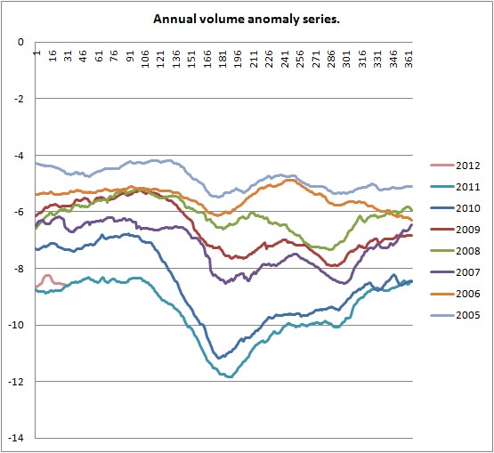
Figure 1, daily volume anomaly timeseries for years 2005 to 2012.
From this it can be seen that a significant drop in volume has been an increasing feature of all of the recent Springs since before 2007. However, as can be seen in the PIOMAS volume anomaly plot, the last two Springs have seen substantially larger drops. Similar graphs of the anomalies show that this pattern of Spring loss is not the case in the 1990s and earlier.
The Bar charts of the net seasonal changes in volume follow. Note that I've scaled them to allow quick comparison between the melt and freeze seasons.


Obviously the bar charts for Autumn and Winter show net volume gains, those for Spring and Summer show net volume losses, reflecting the annual cycle of the sea-ice. Whilst the charts for other seasons show little change, Spring reveals a trend of increasing net loss, with a clear acceleration since the 2000s. Bear in mind that these are not series of volume levels, each bar is the volume gain/loss over that year's season. So taking Spring and a baseline of 4 thousand km^3, the total decrease after 2006 is around 7 thousand km^3, not 2 thousand km^3.
Perhaps the most surprising result is the PIOMAS suggests a recent reduction of Summer sea-ice volume loss {see the PS to this post - there is a reasonable explanation}, perhaps in response to the most recent increase in Spring loss. There is a similar recent increase Autumn, which is to be expected: Ice growth rate is limited by heat flux, thicker ice conducts heat less effectively than thinner ice, open water loses heat in the Autumn and freezes readily and rapidly, so it is reasonable to expect growth in the Autumn in areas of thinner ice or open ocean to be faster than for the thicker ice that has been lost.
However during the summer the main process at play is ice loss, not growth. The last few years seem to suggest a reduction in Summer sea-ice loss, this is despite the summers of 2007 to 2010 having persistent Arctic Dipole anomaly patterns (NSIDC Sea Ice News), such a pattern is associated with sea ice loss not gain. I am unable to explain this apparent conundrum.

Figure 3 shows the last decade to the most recent data for January, in this format the crash of 2007 is apparent as is the 2010 drop, both are of similar magnitudes. Yet the 2007 crash is not so apparent in the earlier seasonal net change bar graphs, this is in part because much of the losses of 2007 happened in the Summer, 2007 is notable as the greatest summer loss of the 2000s. However another factor is that 2007's volume loss was partly accentuated to a preceding low winter level: The winter maximum of 2007 was 23.865, the lowest volume in the PIOMAS record to that date, the range from max to min was 17.407. However 2010's volume range was 18.974, even allowing for Schweiger's stated uncertainty that makes 2010 a bigger annual range than 2007, 6 other years may be as high, due to the uncertainty range, of those 6, 3 are clustered around 2010, 3 are occasional in the whole series. All of which is in the context of a substantially declining trend that has bought the minima down to the order of 4 thousand km^3 from typical volumes of 13 thousand km^3 during the 1990s.
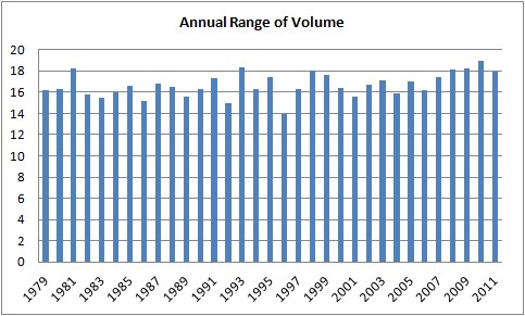
Figure 4, annual range of PIOMAS volume, from yearly maxima to minima in the same year, from 1979 to 2011.
Why was there such a loss of Spring 2010? NSIDC Sea Ice News states that:
Through much of May and June, high pressure dominated the Beaufort Sea with low pressure over Siberia. Winds associated with this pattern, known as the dipole anomaly, helped speed up ice loss by pushing ice away from the coast and promoting melt.This is supported by NCEP/NCAR (Monthly/Seasonal Composites), from that source; June & May show a persistent area of high pressure over the Arctic Ocean, as is shown in figure 5.

Figure 5, sea level pressure anomaly during Spring 2010.
This region of high pressure may have been associated with clear skies, I can't find data to answer that question, however in terms of pressure that is a singular pattern for Springs from 2006 to 2011. Furthermore NCEP/NCAR supports high temperatures, the warm anomaly is again singular in terms of the overall pattern of warmth during Arctic Springs from 2006 to 2011.
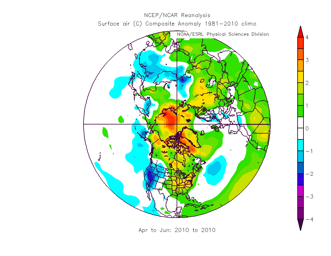 Figure 6, surface temperature anomaly during Spring 2010.
This leads on to Spring 2011, which was another spring of substantial loss, though evidently not as great as 2010 (figures 1 & 2b). Notably weather conditions were not as apparently conducive to sea-ice loss as in Spring 2010. This situation seems reminiscent of the situation regarding extent and area in the post 2007 period. After 2007 no year quite beat 2007's record, probably because 2007 was an event driven by weather acting upon an ice-cap weakened by decades of thinning and volume loss due to anthropogenic climate forcings (models with only natural forcings do not show these changes). Likewise it could be that the massive volume loss of Spring 2010 was driven by weather acting upon a weakened and denuded ice-cap, with the loss of 2011 being part of a consolidation of the losses of 2010.
That the greatest loss in Spring could be a result of weather does not however mean it can be casually dismissed however. Both figures 1 & 2b show a recent increasing tendency towards substantial Spring volume loss, even before 2010. There also is what looks like a change in the shape of sea-ice thickness during the Summer:

A notable feature is that prior to 2010 there is a late Summer 'porch', on the downward slope towards sea-ice thickness minima. The minima themselves occur in late October, probably due to the growth of large amounts of new thin sea-ice. I haven't yet figured out why there is this apparent post 2010 change.
If we are to accept the PIOMAS volume series, and I do, then something substantial happened in Spring 2010. I argue that it was probably as significant an event as 2007 itself. By July, when June's PIOMAS data is out, we will know whether this year rivals 2010 or 2011. As I don't understand exactly what's going on here I can't assert with any demonstrable confidence, but my bet is that this Spring will see another massive loss of volume making it more like 2010/11 than earlier years. If I'm correct then we may have reason to think not only in terms of a pre and post 2007 Arctic, but in terms of a pre and post 2010 Arctic.
I've previously been quite vocal in terms of my criticism of the extrapolation of a fitted polynomial curve to support claims that the Arctic will be sea-ice free in Summer 2015. I've not changed my mind on that, I hate to sound spikey but I come from the school that holds "If you get the right answer but your working out is wrong, you're wrong". But if I am correct about another massive Spring loss this year I will be seriously reconsidering my view on a pre-2020 virtually sea-ice free state (i.e. less than 1Mkm^2, area by Cryosophere Today, at annual minimum).
~~~PS~~~
In the comments Peter has pointed out that there is a simple explanation for the decrease in Summer volume loss, this being that due to earlier melt in the peripheral seas ice loss is effectively leaving the Summer 'bin' to go into the Spring 'bin'.
Because of this comment it struck me that this could have an impact on the main issue, the apparent large losses of volume in Spring 2010 and 2011. I've addressed this as follows:
Thickness = Volume / Extent
Therefore if the 2010/11 loss of volume is due to recession of the perihperal seas thickness should not change as the proportional change in volume will be matched by a proportional change in extent.
I've calculated thickness anomalies using IARC-JAXA and PIOMAS, here is the result:

Therefore the drop in volume in Spring 2010 and 2011 is not solely explained by loss of extent in the peripheral seas. Note that thickness would seem to have dropped massively, for context; calculated thickness on 1 Sept has dropped from a typical 1.4 to 1.7m around 2003 to 0.8 (0.9) in 2010(11). A loss of 0.5m between 1 Sept 2009 and 1 Sept 2010.
23 comments:
Thanks a lot for an inspiring post, Chris.
I like that last graph. I was thinking about doing the same thing some time soon with CT SIA and PIOMAS.
As I don't understand exactly what's going on here I can't assert with any demonstrable confidence, but my bet is that this Spring will see another massive loss of volume making it more like 2010/11 than earlier years.
The Atlantic-Siberian side of the Arctic seems poised for it, but I have no idea what the first-year ice did on the other side, where it was cold most of winter. We now know MYI cover is relatively low, but how thick can first-year ice actually get?
Hi Chris,
1. PIOMAS was recalibrated sometime in the last year. Have you allowed for this?
2. Extent anomalies have been less in the Spring than at any other time of year; i.e. more ice compared to average. Odd that volume should fall at times of area/extent retention...
aka idunno@nevens
It's all a scam;
http://www.real-science.com/hitting-wall
allegedly ;-)
Something odd just happened!
Chris, the 'porch' may be an IARC/JAXA data processing artifact. I made a similar graph of ice thickness using CT sea ice extent and there is no porch.
Ice Thickness graph
What's particularly odd, though, is that my original PIOMAS divided by CT extent graph *did* have a porch; I forgot what the CT data labels stood for and omitted all the ten/tenths grid points. Viewing only the CT data for grids less than 100% concentration resulted in a graph with the same porch you found.
Perhaps the most surprising result is the PIOMAS suggests a recent reduction of Summer sea-ice volume loss, perhaps in response to the most recent increase in Spring loss.
I don't find this particularly surprising. The seasonal ice cover in (e.g.) Hudson Bay / Sea of Okhotsk / Bering Sea has been melting out earlier each year. Since this is fully seasonal ice, it's a reasonably "fixed" volume that forms each autumn/winter and then melts in spring/summer. As such, an earlier melt-out has the effect of shifting the account from the summer tally into the spring tally. Hey presto - increased spring melt and decreased summer melt.
This applies predominantly to regions outside the main basin. For areas such as the Kara Sea, which are contiguous with the main pack, you won't see this effect: an earlier spring melt in the Kara allow heat to penetrate further northward and will lead to more melt in summer, so you don't get the effect of "shifting the tally". In contrast, for Hudson Bay, once the ice is gone, it's gone, and that's it for that discrete area of ice. If if melts in spring, it comes under the spring account. If it melts in summer, it comes under the summer account.
Peter, that sure sounds like a reasonable explanation of the spring-summer shift. I'll try running a breakdown of the ice extent monthly by latitude and see if it corroborates your insight.
Neven,
Thanks. First year ice can grow up to a maximum of between 2 to 3 metres, after which heat flux through the insulating ice is so slow it can't grow thicker over the winter.
Idunno,
1) I've used the most recent timeseries of volume from PIOMAS, Version 2. So yes, that is accounted for.
2) The total volume loss during Spring is much less than during Summmer, however the change of that volume loss is the greatest for any season.
Lazarus,
Just what is to be expected from Goddard.
Kevin,
Thanks for that. I don't think it's an artefact of the JAXA dataset per se. However it may be an artefact of the way extent is calculated, as opposed to area. Thickness is calculated as Volume/Area, so when thickness shows a levelling it implies that the loss of volume is accounted for by the loss of area (or extent). That the 'porch' disappears in recent years suggests that thickness loss is continuing, where previously it had lessened, and reduction of extent was able to account for the change in PIOMAS volume. That 'area' doesn't show the 'porch' indicates that all the way through the melt part of the seasonal cycle changes in area need change in thickness to account for PIOMAS volume.
The reason I don't think that this is an artefact, is that PIOMAS shows a substantial loss of volume in Spring of 2010 and 2011. That's months before the porch has previously occurred, yet the porch fails to materialise in those years, despite having been present in all the years before. The only conclusion I can come to is that the loss of volume (and hence thickness - as the extent can't account for volume) in Spring has changed something about the late Summer's physical behaviour. Using Occam's Razor, it seems to me that the simplest explanation is that PIOMAS does reveal a massive Spring loss of volume in 2010 and 2011, and that this is having knock-on effects into the late Summer.
The porch occurs during the lowest part of the annual minimum of the CAPIE index (area/extent), whereas the annual thickness minimum happens at the end of the CAPIE minimum. I think the existence of the porch in extent-thickness calculation and absence in area-thickness calculations is a direct result of the divergence between area and extent revealed by CAPIE.
Your anecdote regarding forgetting all of the 100% concentration data is interesting. I think I need to be able to explain this as part of really understanding what's going on here. But for the interim, whilst the porch may be an artefact of the extent method, I don't think that this is a negligible artefact. I do think the lack of porch in 2010 and 2011 is telling us something real.
PS - I should explain my use of the word 'porch', it's because such a temporary levelling in the signal is seen in composite video signals, and this is termed a porch.
Peter,
Thanks. I think you're correct, that may explain the reduction in Summer vs the increase in Spring.
With regards the main thrust of the piece, the 2010 volume loss of around 2,000 km^3, i.e. 2x10^12 m^3, also resulted in a drop of calculated thickness, that calculation takes into account extent. Therefore the volume loss in 2010, and 2011 cannot be solely due to reduced area in the peripheral seas. Were that the case we'd see no drop in thickness - as explained in my previous reply to Kevin: I've calculated thickness as; Thickness = Volume/Extent, so if the change of extent fully accounts for the change of volume there is no change in thickness.
I'm now minded to calculate thickness anomalies, if there is a thickness anomaly like figure 1 then it can't be due to extent changes, but I won't be doing that tonight.
Leave it till the morning?
Of course I couldn't leave a puzzle like this...
I've calculated thickness anomalies based on a baseline of 2003 to 2010. I've double checked my results, can't see a problem, but I will check again in the morning when I'm not tired.
You may want to put tht drink down before you see this.
http://farm8.staticflickr.com/7203/6949692555_39ee0f090e_o.jpg
The point here is elucidated in my previous reply to Peter.
Those are only for 2003 to 2011 because I was using JAXA. Today I've got Cryosphere Today's series of ice area since 1979, via Neven's blog. So I may re-do all of the calculations from 1979 to present using both area and extent.
Now I can watch The Big Bang Theory in peace. ;)
Chris, I've plotted PIOMAS divided by CT Area and PIOMAS divided by JAXA extent on the same graph for comparison. Volume divided by Area and SIE
I find the differences between the waveshapes of the annual cycles quite interesting. While the SIE 'thickness' had a 'porch', the Area thickness had a 'roof.' As you noted the porch disappears in the last couple of years - and so does the 'roof' on the Area thickness measure. The two shapes are now almost indistinguishable from one another.
I still think we're dealing to some extent with data processing issues. All three measures (volume, SIE,and SIA) are correlated. They're each based on the same sensor data. Still, trying to tease out explanations of why these waveshapes used to differ and now appear similar is a puzzle with no obvious explanation.
The SIE waveshape has changed from roughly symmetrical rise & fall times (ignoring the porch for the moment) to one more closely resembling a positive ramp. I think we can attribute this to the 'Tietsche' effect; more ice melt leads to quick refreeze.
The SIA waveshape used to have a noticeable 'roof' (positive pulse duration or duty cycle) and, to a lesser extent, a 'floor'. It is now more sinusoidal/triangular. For extended periods, at both thickness minima and maxima, volume was increasing or decreasing at the same rate as area. Today there are no such extended periods when thickness is unchanged.
Prior to 2007 the volume minima was reliably 40% of the maxima. In 2007 that dropped to 30%; 2010 & 2011 dropped to 20%. Obviously for an ice-free arctic the number has to approach zero. The amplitude of a possible seasonally ice-free arctic (volume, SIE,or area - take your pick) is open to speculation. The floor has to reach zero and it's currently still greater than 1m. It's lost .5m in the last ten years - which would point to 2030 as one possible prediction of a seasonally ice-free arctic.
What we're missing - and likely to never see - is a breakdown of the volume losses by cause; direct solar, atmospheric temperature, ocean heat, ice mechanics/kinematics. More importantly, how do we categorize and measure the *lack* of volume recovery? It's that lack of volume recovery that's driving the lower numbers.
Since winter solar is pretty constant (near nil), the lack of volume recovery has to be one of the other factors. Determining which one is playing the lead role is difficult to determine - though I'd place my money on ocean heat content. The DMI winter anomalies have all been positive for quite some time.
I think ice temperature has to be playing a large role. In an earlier era the ice was cold enough that the first few weeks of direct solar really just 'prepped' the ice for summer melt. Now we're seeing significant volume losses much earlier in the melt season.
I'll be interested to hear yours (or anyone else's) explanations for the differing thickness waveshapes and their recent changes.
The area-thickness Winter maxima levelling - here's my explanation: By this stage of the year the sea-ice has already rapidly grown most of it's thickness, subsequent increases of thickness in the main basin will be limited by the insulating effect of the ice. The change of volume as calculated by area is mainly accounted for by change in area in the peripheral seas, outside the Arctic Basin - so thickness levels. This is not the case in extent because extent is insensitive to increases in area in cells of over 15%, i.e. area will pick up a lot of increase between 15% and 100% whereas extent will see that as no change. Hence the extent-thickness curve shows continued thickness growth and a rapid transition to loss, because PIOMAS shows a change in volume that must be accounted for, but in the peripheral seas extent change reduces and concentration changes within cells occurs (which is missed by the extent calculation).
That both the porch (extent) and roof (area) disappear in the last two years cannot be a coincidence.
Why has the area-thickness peak changed? - the sharpening of the peak for the area based thickness calculation implies that in 2010/11 the change in area is not accounting for the change in volume, so a change in thickness is 'needed' to balance the equation. Why would this be??? Crucially this happened before the Spring loss of 2010, although the thickness anomaly plot (figure under the PS) shows thickness anomaly grew from before Spring 2010 - so have I mis-attributed the 2010 Spring crash to weather. Is it something else?
To recap regarding the extent thickness porch - here the loss of volume in the summer is accounted for by a loss of extent, therefore to balance the thickness equation no change in thickness is 'needed'. However in the last two years loss of volume has been accounted for as a combination of loss of thickness and loss of extent - hence the 'new' loss of thickness.
So in both cases, the winter flattened peak in area, and the summer porch in extent; their loss is because thickness had to change to balance the equation, whereas previously only area/extent changes were needed during those periods.
Please, please, tell me I'm wrong about this!
Actually, from my PS to the main post (I think you might have missed it) thickness has lost "0.5m between 1 Sept 2009 and 1 Sept 2010", i.e. virtually all of the loss was over 1 year. I'm not sure if PIOMAS would produce diagnostics such as losses by cause, the assimilation process means they may not be able to calculate, note that Schwieger states that PIOMAS accuracy is greatly improved by assimilation of observations.
I'm not sure about ice temperature per se having a role. I suspect that the key issue is thickness. Thinner ice would be warmer as it could convey more heat from ocean to atmosphere. But I'm really beginning to wonder if the sea-ice has hit a tipping point in winter 2010, and that weather conditions in the Spring may have been incidental.
That's why I'd appreciate it if you, or anyone else reading this could tell me why I'm wrong about the reasons for the loss of porch and roof.
Chris, I think the 9/1/09 to 9/1/10 comparison is a bit misleading. The H(sie) minima in 2009 was 1.08m, in 2010 it was .84m; the H(area) min was 1.34 in '09 and 1.12 in '10. This seems a more valid comparison. Still sizable, but 1/4 instead of 1/2 meter.
I'm not sure it's correct to say winter flattened the peak in area. Winter caused the peak amplitude, but the roof extended all the way to the end of melt season. In the past volume and area decreased at the same ratio during the melt season leaving thickness (at its maximum) unchanged.
ROOF & PORCH --
The roof and the porch occupy the same calendar timeslot. The midpoint of the roof is July 1. The falling edge of the roof coincides with the falling edge of the porch -- approximately 9/22. The roof occupies what we'd typically consider the core of the melt season - Roughly May 15th to Sept 15th. So during the melt season, volume and area were falling at the same ratio. Once the melt season ended, area gains quickly outpaced volume gains. This causes average thickness to drop as lots of thin ice is added into the equation. The porch is, as you state, undoubtedly a relic of the way extent is calculated.
I'll huff and I'll puff and I'll blow your house in ... or at least your roof and porch.
The rising slope of both area and extent have always been coincident. Today the roof is gone and the area peak is nearly coincident with the extent peak - approx. June 1st. We cannot attribute this to area gains - it's the beginning of the melt season. This then is all volume loss outpacing area or extent loss.
Since this ratio change is happening during the melt season, volume loss can be attributed to any or all of the factors that contribute to melt. I suspect that further examination isn't going to fingerprint one culprit, but that *all* of the factors are working in tandem.
The question is - was this an episodic (and brief) perfect storm - or is this the new reality? If it's the new reality, then 2007 wasn't a wakeup call, it was a death rattle.
Kevin,
I don't think using 1 Sept was misleading, it certainly wasn't intended to be. I just picked a convenient date late in the season, choosing one date, rather than using the minima ties in with my most recent graphic - using anomalies calculated by day. For the record, the series on 1/9/2003 to 1/9/2011 is:
2003 1.661682204
2004 1.716253036
2005 1.688746187
2006 1.572467048
2007 1.443880017
2008 1.555316626
2009 1.339406681
2010 0.871772018
2011 0.903504611
I'm working at present on a new spreadsheet. I'd been using data from this link, obtained at Neven's.
http://arctic.atmos.uiuc.edu/cryosphere/timeseries.anom.1979-2008
But I'm suspicious of it, values regularly recur throughout it, so I doubt it's real data. Do you or anyone else know of any sources for sea ice extent and area daily from 1979 to date?
The point is that JAXA is now of little use after the failure of AMSRE. That data (which seems to be used for the CAPIE index) is up to date, and allows comparison over the full period from 1979. So all we need to wait for is PIOMAS.
Thanks for setting my mind at rest by clarifying your graph, the prospect of 2010 as a weather driven event is far more preferable to it just having happened - that leaves one explanation, a tipping point. Of course that cannot be ruled out with regards 2011. Things are bad enough without being in a 'tipping point'.
With regard my explanation, yes ammend it - spring area-volume losses were accounted for by changes in area, hence calculated thickness didn't change as much (leading to the 'roof'). If I understand you, we can agree that the loss of both porch and roof are due to increasing losses of volume. And I agree that the continuation of calculated thickness loss into the Autumn is due to growth of thin ice.
Regarding 2007. It's notable that 2007 doesn't show substanially in the thickness anomaly (graph under PS in the main post); this is because 2007 was mainly an extent/area loss event, with loss in volume being an incidental (but important) result of the changes in extent/area. One aspect of volume's importance being that it carried the 'impact' of 2007 through to the following years despite winter growth in extent/area.
What I am arguing is that in Spring 2010 something every bit as important as 2007 happened, this time manifesting itself as a volume impact rather than an extent impact, due to its timing in the early part of the season. I'm fairly sure that the volume crashes of the last 2 years will be repeated again this year. If so 2010 could well be a more significant threshold event.
Over at Neven's Idunno has solved the problem with the answer I was suspecting after looking more carefully at the data, column 4 isn't extent, it's the baseline average.
So if anyone reading knows where I can get daily extent from 1979 - please post a link to source page. Thanks.
Chris, when I said misleading I didn't mean *intentionally* misleading. I just meant it was giving a result that was misleading and that comparing minimum to minimum was not nearly as dire a result :)
I think if you look again at the area thickness plot you can see the 'roof' being eroded away. 2008 is solidly above 2007, but 2009 sees half of the area between porch and roof lost. That follows the miminum as percent of maximum numbers I mentioned. Dropping from 40% of maximum to 30% of maximum. Then 2010 and 2011 fall to 20% of maximum. So I'd say that 2010 was a continuation of the deterioration we saw in 2009.
In two years time (2008 - 2010) the minimum as percent of maximum fell from 40% to 30% to 20%.
I've been accepted into ESA's cryosat-2 data program (I think that anyone that asks is allowed access) but no data products have been made available yet. There is an Iphone/Ipad app for cryosat-2 available, but I don't know of anyone that's tried it (so I don't know if data is available there yet either).
I'm starting to hope that PIOMAS made a terrible mistake and all their numbers are off by the equivalent of a meter of thickness :)
Kevin,
I know you weren't saying I was deliberately overstating, I just wanted to say how I'd come to those figures. In a qualitative sense the message is the same - a large drop between 2009 and 2010, but this is supported more directly from figure 1 and figure 3.
My concern regarding the roof and porch is not the levels, but the absence in 2010 & 11, despite these fetaures having been a regular part of the timeseries preceding that period. On this issue - I now have extent from 1972 (courtesy of Chris Randles), area and volume from 1979. These sequences have been reconciled and put in a spreadsheet, so I'm going to look at all this again from a longer term perspective.
I don't see 2010 as a continuation of 2009, figures 1, 3 and 7 do not suggest this. Indeed if 2010 looks like any year it looks like 2007 - a substantial drop. 2007 was a combination of weather and long term preconditioning by AGW. I think 2010 is a combination of the aftermath of 2007 and weather.
Great news re Cryosat, if you get info from them and want a guest blog post just let me know. Indeed if you find yourself disagreeing with me on this subject you can have a guest post.
I'm past hoping there's a problem with PIOMAS. It's well validated against past thickness observations, the problems it has aren't in our favour: I quote from Schwieger et al "PIOMAS appears to overestimate thin ice thickness and underestimate thick ice, yielding a smaller downward trend than apparent in reconstructions from observations." The ice pack is now largely thin first year ice...
Applying Occams razor to the three possibilities:
1) Our calculations are wrong - these are trivial calculations, speaking for myself I can't find an error. And if I couldn't handle this level of math the lab where I work would know very quickly.
2) PIOMAS is wrong - this would reauire that PIOMAS has developed a fault, as it's been throroughly validated using [past data. The contortions needed to support this conclusion are substantial.
3) PIOMAS is continuing to show the same performance regards thickness, hence volume, found in Schweiger etal. Our calculations are correct - what we're finding is real.
Occams razor - option 3 is the simplest option.
Sorry if I come across as terse - not meant - I've been up since 0430 and only got home at 1900, so I'm knackered.
Kevin O'Neill wrote:
In two years time (2008 - 2010) the minimum as percent of maximum fell from 40% to 30% to 20%.
Kevin O'Neill replies: I have no idea where I pulled those numbers from because they are definitely incorrect.
Here's what I should have been looking at September Volume as % of Maximum
2002 39.7%
2003 38.1%
2004 39.2%
2005 36.3%
2006 37.2%
2007 27.8%
2008 30.6%
2009 28.6%
2010 19.7%
2011 19.5%
This affirms your view that 2010 was as significant in regards to volume decreases as 2007.
Kevin, don't you just hate it when that happens, especially when the result is things looking worse. I'll be doing another post on this matter in the next few days, particularly about the porch and roof. And I'll be moving from extent to area as a result of your comments. I agree the porch is a result of the way extent is calculated but I still think its loss in the last 2 years is significant. BTW the roof and porch are regular features since 1979.
I'm going to have a night off all this tonight and let my subconsious work on it.
Post a Comment