The regional PIOMAS derived data I have previously released, and which is used throughout this post, has now been updated through to November 2013, it is available in CSV files here. Thickness calculations have not been updated for 2013 because they need concentration which has not been released.
Once again, thanks to Dr Jinlun Zhang and colleagues at the Polar Science Centre for making the gridded PIOMAS data publicly available.
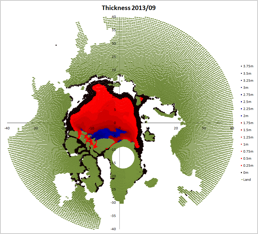
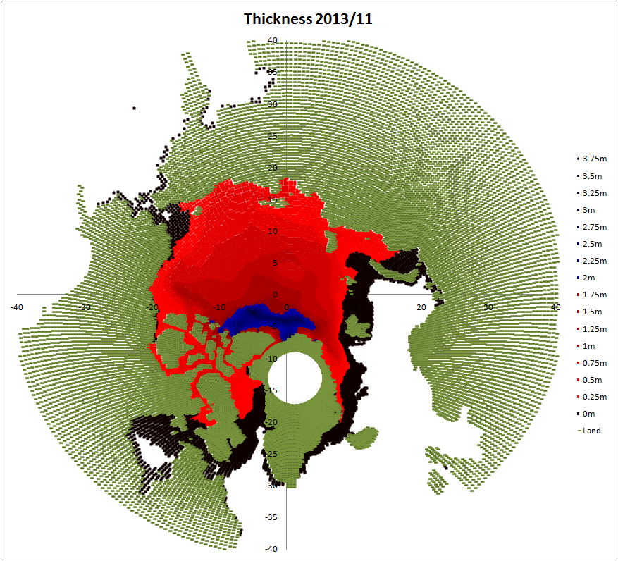
First a set of map-plots, I've only got half way through reworking that set of code, and find that making difference plots needs a re-write of a core piece of code, so no interannual difference plots. Sorry. Anyway for 2012 and 2013 are presented the thickness fields for September and November.


To me the data really gets interesting however with the regional breakdowns. Regional data has been recalculated up to November 2013, apart from thickness because concentration files haven't been updated. 'Other' is the ocean outside of any of the regions, ESS is the East Siberian Sea, CAA is the Canadian Arctic Archipelago.
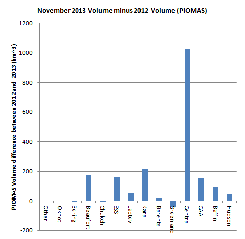
The November difference between 2013 and 2012 is shown above. As is to be expected the greatest increase from last year is in the Central Arctic region. For completeness September 2013 difference from September 2012 is presented here.
The time evolution of changes can be better seen by looking at the monthly differences between 2012 and 2013, in the following table volumes are in cubic kilometres.

Throughout the winter 2013's volumes in regions off Siberia were higher than in 2012, however other regions, such as Beaufort were below 2012. NCEP/NCAR shows that temperatures in 2013 were colder by up to 6degC over Kara, Laptev and Barents when compared to 2012, while over much of Beaufort and Chukchi they were around up to 3degC warmer when compared to 2012 (mean for Jan to April, 2013 - 2012). However as I have posted previously, the cause of such warmth could be thinner or more broken sea ice, certainly the Barents temperature difference extends up to over 500mb but is not visible at 300mb, suggesting the cause was warming caused by thin or low concentration sea ice in 2012 (which would then manifest as a cooling in 2013 with thicker sea ice).
Due to the February break up in Beaufort expectation from some quarters was for an aggressive melt season in 2013, what happened was that in May Beaufort started to exhibit more volume than 2012. This is similar to the Central Arctic where 2013 had progressively larger volume after June, by August and September the higher volume in the Central Arctic account for 68% and 76% respectively of the total volume increase in 2013.
June and July show the widespread nature of the retarded melt as compared to 2012, both the Siberian and Canadian sides of the Arctic show substantially increased volumes in 2013. In July the ESS, Laptev and Kara accounted for 33% of the total increase in volume with respect to 2012, with the CAA, Baffin/Newfoundland and Hudson Bay accounting for 14%.
One of the interesting details is the Greenland Sea, throughout the whole of 2013 volume levels were below those of 2012. This is probably because in 2012 the Arctic was under high pressure causing net divergent movement of the ice increasing sea ice export through the Greenland Sea, whereas in 2013 overall pressure was low, causing anticyclonic movement and convergence of sea ice in the Arctic Ocean, suppressing export of sea ice.

For the regions within the Arctic Ocean the increase of volume is placed in context, as a small uptick in volume when measured against the general decrease in all regions since 1978. Any talk of recovery must take into account the mountain to be climbed before the volume gets back to the normal before the impacts of Anthropogenic Global Warming.
In the above graphic the greatest decline of volume throughout the record is seen to come from the Central Arctic, indeed this accounts for the bulk of the overall decline in volume and comes largely from the decline of thick multi-year sea ice. Below is shown the thickness distribution for recent years.
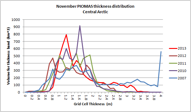
By November, 2013 is seen to have a high peak volume that is at the lowest thickness for any of the years shown (for a peak of that size, 2012 had a lower thickness peak, but the overall volume was smeared higher. This suggests that in 2013 there is a large proportion of sea ice which is below the equilibrium thickness for winter sea ice growth of 2m, implying that significant volume gains can be expected in the Central Arctic throughout the rest of the winter. However also worth noting is that, aside from 2007, 2013 has the fattest thicker ice tail than any of the years shown, demonstrating the survival of much thick ice in the PIOMAS model results for 2013. Given that the volume gain from minimum to 30 November is higher than any year apart from 2012, I still expect most of the volume gain shown by September 2013 to carry over into next year's melt season.
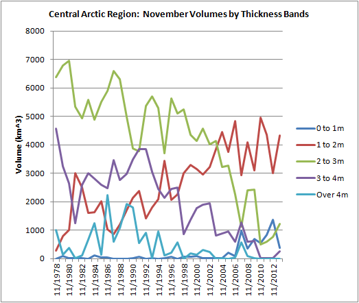
Breaking the November volume for the Central Arctic into 5 bands of thickness reveals changes throughout the record. Sea ice over 4m thick remains low, grid boxes reporting this thickness are largely off the coast of the CAA and Greenland. The uptick in volume following the 2013 melt season is shown to be due to the 1 to 3m thick bands, with a small offsetting decline in the thinnest ice (below 1m thick). For completeness the September distribution is shown here.
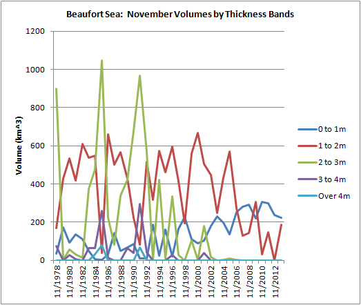
Using the same approach, the Beaufort Sea shows that the November increase in volume over 2012 in that region is due to ice in the 1m to 2m category. This was at very low levels following the record 2012 melt season and late re-freeze, but has increased this year due to the lesser melt of 2013.
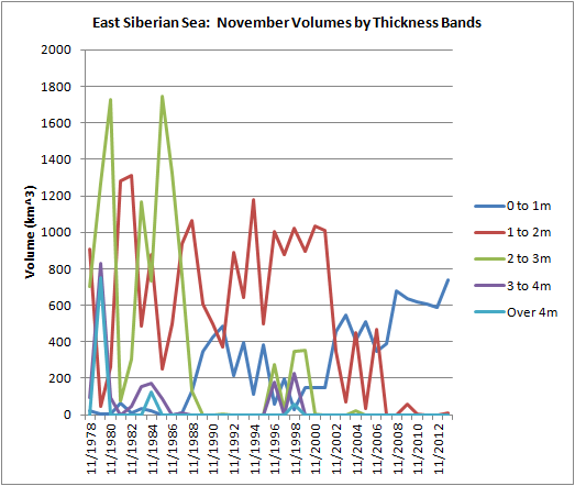
In the ESS ice from 1 to 2m shows only a negligible increase, despite that region not melting out this year, ref, implying that the ice during September was thin and fairly scattered, as seemed to be the case from satellite observations. Here the increase comes from the 0 to 1m category.
As I have been expecting, 2013 represents an opportunity to see what happens when a pulse of volume is put into the sea ice system, which has otherwise been showing a precipitous drop in volume over recent years. Compared with 2012 I think 2013 has been a more interesting year, the unexpected always offers more learning opportunities than the expected. But if I had my say I'd take a phenomenal crash, they're just more exciting to watch.
For what it's worth: I don't expect a crash next year.
4 comments:
"By November, 2013 is seen to have a high peak volume that is at the lowest thickness for any of the years shown (for a peak of that size, 2012 had a lower thickness peak, but the overall volume was smeared higher. This suggests that in 2013 there is a large proportion of sea ice which is below the equilibrium thickness for winter sea ice growth of 2m"
You could well be right and I think I should accept that the thicker over 2m ice which I think is off Ellesmere Island will stay thicker than in 2012.
For ice less than 2m thick a few things to say:
1. There is a higher peak for ice of thickness 0.5m to about 0.9m in 2012. This is less than half the equilibrium thickness so the thickening left to be done is more than the area difference on your November volume by thickness band graph. Whereas for ice thicknesses between 0.9m and 2m the extra thickening to go is less than the area difference shown.
2. You are only suggesting the thickness will increase towards the equilibrium thickness. Presumably 2012 also moved towards the equilibrium thickness so if there is no change in equilibrium thickness then the volume moves towards the 2012 volume for ice thickness below 2m.
3. The peak volume by thickness band in April 2013 is at a lower thickness than in 2012. This suggests a lower equilibrium thickness in 2013 than in 2012. With higher GHG levels and perhaps higher upward heat flux, the equilibrium thickness might be lower again in 2014 or at least still lower than in 2012.
4. You haven't considered whether the equilibrium thickness might depend a little on the history of how much insulation there has been since the minimum. e.g. more insulation from early on in freeze season might mean the thickness stays further below the equilibrium thickness.
Not sure if I am getting confused now and seeing arguments to support my position that don't really stack up. Anyway, I think I have moved my position somewhat accepting the ice over 2m thick that is thicker than in 2012 will stay thicker than in 2012. That might well outweigh some small effects above so that the maximum volume in 2014 is unlikely to be a record low.
Crandles,
1) If I've got what you're getting at wrong then please correct me...
The higher peak in 2012 is for a lower volume, I make it about 450km^3, whereas in 2013 the peak is about 800km^3. The 2012 peak is at 0.8m, the 2013 is 1.2. The 2012 peak being about half the 2013 volume, at about 1.5 of the thickness.
Now if we had half the volume at double the thickness the two should cancel and raise a reasonable expectation of a similar outcome. But to raise the 2013 peak to around 2m implies a greater volume gain - by this simple reasoning. I think (it's been a long day)...
2,3,4) The April thickness profiles are shown here.
I think all of these are potentially valid, but I'm not convinced that the effect happens from year to year. Using pentads (5 years) from 1978 to 2012 and 'post 2010', see this graph.
What I'm seeing is a general shift downward as the time periods pass, but a squeezing up and raising like a wave breaking as the 2m limit is reached.
I'm not sure about the previous melt season affecting equilibrium thickness, although perhaps the Cantrel region isn't the best place to examine this. The peripheral oceans might be better, with longer open water in autumn.
Sorry to be brief but I've had a long day.
I should probably have written a lot more simply that I agree with JDAllen that "the profile next April should look a lot like 2013"
On reflection I don't think it matters much how far or near the peak is to the equilibrium thickness the areas with thickness under 1.8m are going to thicken up towards the equilibrium thickness. So ignore what I wrote in 1) above.
A lot like April 2013 but above 2.4m thickness, I expect more volume in 2014 and we are not quite sure where the peak will be. A downward general trend but noise could cause 2014 to be higher than 2012 but it is more likely to be lower than 2012 than higher.
>"I'm not sure about the previous melt season affecting equilibrium thickness"
I am not sure either but I was attempting to talk about the history of thickness from the minimum to the maximum. To me thicker ice from minimum to February means slower heat flux through the ice such that upward heat flux is less likely to tail off than if heat had been rapidly moving up through water and thin ice. However I am not sure whether this has any significant effect.
From what I've seen in the data, summarised by the low R2 of linear fit to the scatter of minimum area/extent and volume gain in the following season; weather will play a large role.
I agree with regards heat flux and the possibility that this will imply less volume gain. I'm just not sure it will diminish the volume gain to come in the rest of the season. I'd been expecting this effect to reduce the volume gain up to the 30 November, it hasn't.
I think we'll just have to wait and see what happens and see what can be determined from the result. But because volume gain reaches the maximum asymptotically we should have a reasonable idea by end February (off the top of my head without checking the data).
I'm bowing out as I'm busy for Christmas for the next few days. Have good one.
Chris.
Post a Comment