So I've decided that the final post of 2013 will be a look at percentage open water formation, and a clarification of what I think is a tipping point revealed by the PIOMAS data. Regular readers may already have grasped what I've been getting at before, but now is the time to stop hinting (i.e. 'non-linear') and say exactly what I mean.
EDIT 23/7/14 - after months of consideration and 2014 April data, I have concluded that the effect outlined here will be countered by winter ice growth. More here.
The plots in this post present the percentage open water in September formed from ice covered areas in April as a function of grid box effective sea ice thickness in April. Decadal averages are used for the 1980s (1980 to 1981), 1990s (1990 to 1999) and 2000s (2000 to 2009). The post 2007 period (2007 to 2012) and the post 2010 period (2010 to 2012) averages are also used because these two periods follow substantial 'crashes' in sea ice volume in PIOMAS that have affected the seasonal cycle in extent/area or volume. It was not possible to calculate for 2013 because concentration data files are not available through to September 2013 (only thickness is available to May 2013).
All of the plots here are calculated from gridded PIOMAS data, sourced from here. April thickness is taken as the April effective thickness (heff.hxxxx files), percentage of open water in September is calculated by summing April and September grid box areas, each grid box multiplied by its concentration (area.hxxxx files). Percentage open water is then the percentage of ice area in April that becomes open water by September. Grid box areas are calculated using the 'Zhang method' with no minimum thickness applied in subsequent calculations, more will be explained about that when I post in the new year about the improved grid box areas.
First the peripheral seas of the PIOMAS domain, the gulf of St Lawrence is not included in the PIOMAS domain.
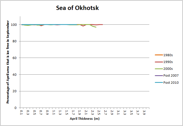
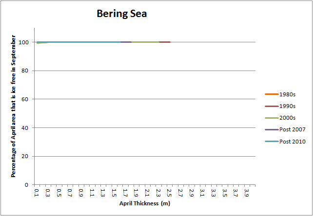

All of the peripheral seas have totally seasonal ice cover and have had throughout the post 1978 period, I neglect a small survival of ice in Hudson Bay, which also is not a sea ;) . Hence their plots are 100% open water formed for all ice thickness categories existing in April. Note that as with the following plots where data is not plotted there is no ice of that thickness in April.
Another peripheral sea, the Greenland Sea, shows what will be seen to be a rather unusual open water for initial thickness profile in comparison with other regions.
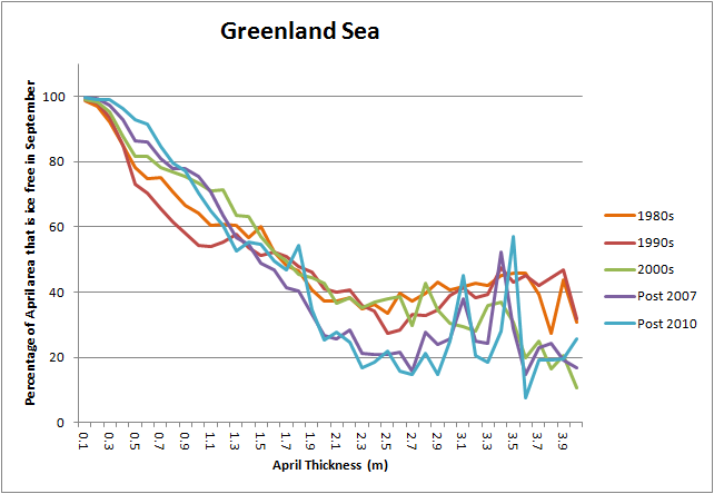
The Greenland Sea is a conduit for ice from the Central Arctic to melt out through the Fram Strait. As such grid boxes in April reporting thicknesses under 2m thick do not totally melt out, because new ice comes in to replenish them, excepting the very thinnest peripheral ice in winter. With regards that thinnest ice, the thicknesses are the thicknesses of entire grid boxes, during winter there will be lateral growth of thinner ice. The thickest grid boxes also show more open water in September because the entire tongue of ice in September is smaller than in April, and by September the Greenland Sea is receiving thinned ice from the Central Arctic. In opposition to what will be seen in regions within the Arctic Ocean the two recent periods show less percentage open water formation compared to earlier decades. I've not had the time to investigate this but suspect smaller extent in April during those periods. Cryosphere Today shows that the early 2000s had greater area of ice at peak, link, so the recent years will not benefit from that.
The Canadian Arctic Archipelago (CAA) shows substantial thinning post 2007, but is also the first region to be considered that lacks very thin ice in April, hence the plots do not have values of April thickness near zero.
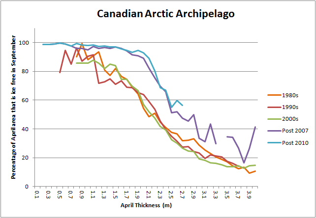
In the 1980s and '90s there was always a residual amount of ice in the CAA, by the post 2007 and 2010 averages substantial thinning and greater open water formation for all thicknesses is apparent. Notably 2010 appears to have removed all grid box effective thickness ice over about 2.7m thick.
Now to the seas within the Arctic Ocean surrounding the Central Arctic region.
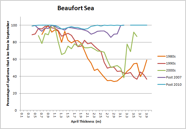

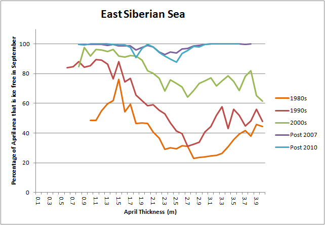
As can be appreciated from the area data at Cryosphere Today, and to a far more limited extent MASIE, the Beaufort, Chukchi, and East Siberian seas have been virtually seasonal since 2007, this also applies to the Kara Sea (below). This seasonal ice state (as opposed to one in which much of the ice survives the summer) can be appreciated by the post 2007 & post 2010 plots hugging the 100% open water formation upper limit. Beaufort also shows the thinning that has occurred, this is not so say that thinning has not occurred elsewhere, but these plots are not designed to diagnose changes in volume as a function thickness, which will be addressed below.
The seasonal state in these seas is significant in that ice that would have entered these seas from the thick pack ice off the CAA to be aged and returned into the transpolar drift, now faces destruction rather than ageing. This failure of the Beaufort Gyre Flywheel has played a significant role in the further decline of multi-year ice since 2007.
Moving along the Eurasian coast towards the Atlantic we have the Laptev, Kara and Barents Seas.
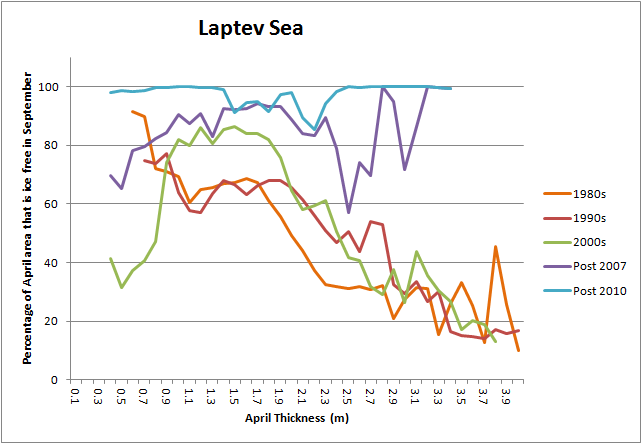

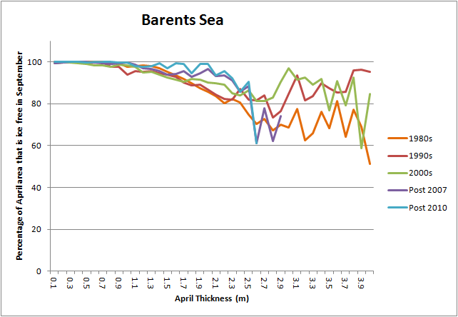
Along with the previous set of three seas (Beaufort to East Siberian), the Laptev, Kara, and Barents seas show an increase of open water formation with each passing decade. However this is muted in Barents, probably because Barents is a peripheral sea under the influence of the influx of warm Atlantic water.
This Atlantic water influx has meant that throughout the 1980s onwards the Barents Sea has always been largely seasonal, with high percentage open water formation, the purple (post 2007) and blue (post 2010) plots do however reveal recent thinning. However the extents of recent decades are really the end of a long process of loss of ice in Barents, from the Barents Portal, shown here is a plot of the 1886 winter ice edge compared to the 2012 winter ice edge.
So within the Arctic the transition to a seasonally sea ice free state has already occurred in the peripheral seas. This means that the peripheral seas of the Arctic Ocean are now behaving more like the peripheral seas of the PIOMAS domain (first three graphics) than in previous decades. However as this year shows, and possibly as result of the volume pulse of this year, also next year, this seasonally sea ice free state is not yet wholly entrenched. But what of the Central Arctic region? In order for the whole Arctic Ocean to transition to a seasonally sea ice free state the central Arctic must show similar behaviour to the peripheral seas.
So what is going on in the Central Arctic?
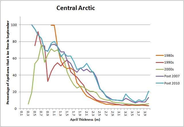
The pattern of change in the Central Arctic is complex, however thicker categories have been showing greater percentage open water formation. At the thinner end a problem with this presentation of the data becomes clear, it does not take into account the volumes of ice involved in the percentage open water formation. As will be seen even in the post 2010 category ice under 2m thick in April only accounts for 20% of total volume, and is lower in earlier periods, so different behaviours at the interior and periphery of the Central Arctic region could account for the complexity and lack of obvious pattern for thinner ice.
If we split the Arctic sea ice into two regions, within the Central Arctic region (above) and outside the Central Arctic, the tendency of the peripheral seas to shift to a seasonal state (where percentage open water formation is 100% for all April thicknesses of ice) becomes clear. The plot of percentage open water formed for all thicknesses is substantially closer to 100% for 2010 to 2012 than for any previous plotted period.

Returning now to the peripheral seas the key question is what has been causing the transition to a seasonally sea ice free state? Using the same periods as above I have calculated the percentage of volume accounted for by grid boxes of four thickness categories to show the changes of proportion of volume with each passing time period.

It can be seen that the seas that have transitioned to a seasonally sea ice free state have done so as the bulk volume transitions from the 2 to 3m thickness band down to the 1 to 2m thickness band. Why this should be important is shown by the percentage open water formation with thickness plot for the whole PIOMAS domain.
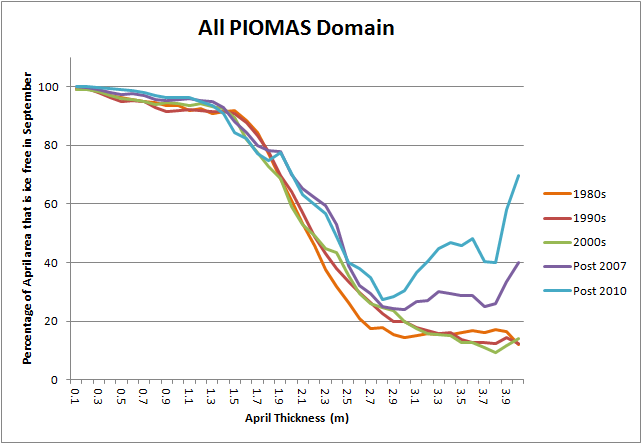
As the ice thins such the the bulk of volume is at grid box thicknesses of around 2m thick it falls into a region where the rate of open water formation with declining April thickness reduces at a very rapid rate. I've previously presented this calculation of all PIOMAS domain percentage open water as a function of April thickness and have mentioned the non linear nature of the curve. But it strikes me that perhaps I have not been explicit enough about what I am getting at.
In Lenton 2012, "Arctic Climate Tipping Points", PDF, the author discusses various facets of Arctic tipping points against the background of theory surrounding tipping points.
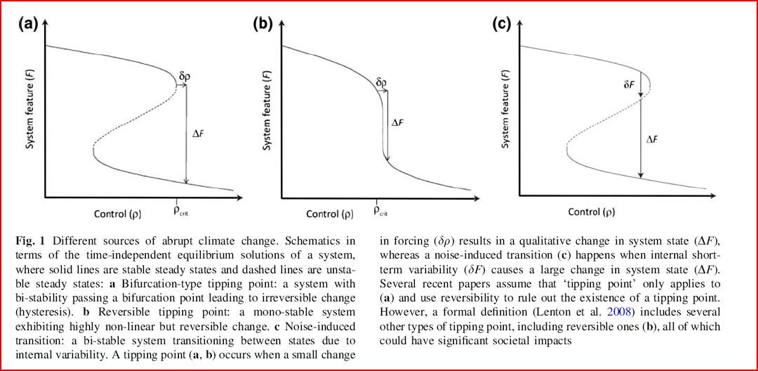
In the above images a control variable is selected from the data available from the system under consideration, this is then plotted against a key system feature to plot the behaviour of the system. In terms of determining a tipping point in sea ice the most obvious candidate for the system feature is sea ice area/extent, because we are considering the possibility of a rapid transition to a seasonally sea ice free state. I have used percentage open water as representative of area/extent, which allows me to consider the behaviour of open water formation in terms of April (~peak) thickness. So in terms of the above graphs my Control variable is April thickness, and my System Feature is percentage open water formed by September.
For the whole Arctic the plot of percentage open water formed as a function of April thickness looks strikingly like a specific instance of the general case 'b' above. In other words, not a tipping point with hysteresis, (a bifurcation tipping point), but a reversible tipping point. However I think 'reversible' here means 'theoretically reversible', AGW isn't going to end any time soon.
This however gives no direct information about the speed of transition. From the table of percentage volumes it can be seen that the Central Arctic is in the process of stepping down from the 3 to 4m band to the 2 to 3m band, having already largely stepped out of the 4m and above thickness band. How fast this process will continue is hard to say. Furthermore the Central Arctic is physically protected as the ice edge must recede during the melt season through the peripheral seas of the Arctic, how fast can that process proceed even if the Central Arctic drops into the April thickness region concerned?
An argument against my use of the whole PIOMAS region curve might be that the whole region covers many latitude bands and geographical situations. However from my reading of the peripheral seas of the Arctic I am seeing hints of the curve in past data (1980s and 1990s) before they transitioned.
A final issue to consider is what might drive the acceleration suggested in the plot of all PIOMAS domain percentage open water formation? The most obvious candidate would be ice-albedo feedback. From the persistence of the ice and lack of precipitous crash following 2007 we already know that this feedback is countered by strong negative feedbacks, enhanced autumn/winter ice growth and heat loss being likely the prime movers. However equally, from the volume loss in the Arctic Ocean since then, we know that not all the energy gains, and effect of shortened ice growth season, is being over-ridden by these negative feedbacks.
However these issues aside. With the data reported here, I think it foolhardy to dismiss out of hand claims by people like Maslowski and Wadhams that we face a rapid transition to a virtually seasonally sea ice free state across the bulk of the Arctic, including much of the Central Arctic, by the end of this decade.
And with that my blogging for 2013 is at an end, Merry Christmas and a Happy New Year to one and all!
4 comments:
Chris, nice summary of the data.
One of the items I've run across recently is that Maslowski couched his definition of "nearly ice-free" in terms of volume - and by that he meant an 80% reduction from the 1979-2000 baseline.
By that measure 2012 was almost nearly ice-free - though 2013 saw a significant backslide.
Have you the data to run a progression of the OWFE change by latitude? This might give some indication of the time necessary for the central arctic to reach 100%.
Enjoy the time away from work.
Hi Kevin,
The main Maslowski 'seasonally ice free' claim I've been working off is the 2016 +/-3 years, in the Fresh Nord presentation he annotates his graph with an unspecified surviving residual amount of sea ice. In his 2012 paper, if I recall correctly, he doesn't include this proviso.
If we're talking predominantly first year ice then winter 2012/13 was at that state.
I could work things out by latitude but I'd need to be persuaded, and would be loathe to do it before the New Year. The problem I see is that the Arctic isn't concentric around the pole. Actually the seas and central Arctic turn out to capture the changes very well, better than I'd hoped when I set out to work out the regional breakdowns.
I am tempted to follow Wipneus's lead, but not go so far. And use NSIDC gridded concentration data to work out regional extent and area. I have everything I need in principle, and I'm not aware of regional timeseries of extent and area. There are graphs but compared to a numeric series graphs suck.
Chris, Joe Romm revealed the 80% volume reduction while discussing one of his (Romm's) sea ice bets:
"*This projection is based on a combined model and data trendline focusing on ice volume. By “ice-free,” Maslowski tells me he means more than an 80% drop from the 1979-2000 summer volume baseline of ~200,00 km^3. Some sea ice above Greenland and Eastern Canada may survive into the 2020s (as the inset in his figure shows), but the Arctic as it has been for apparently a million years will be gone."
http://thinkprogress.org/climate/2010/06/06/206155/arctic-death-spiral-maslowski-ice-free-arctic-watts-goddard-wattsupwiththat/
Kevin,
Here are the percentages- percentage of 1979 to 2000 average, for daily max and min. Perhaps using monthly averages would be best.
Year Max Min
2007, 79.06, 46.90
2008, 83.34, 51.36
2009, 83.09, 50.06
2010, 77.52, 32.16
2011, 72.75, 29.17
2012, 72.62, 23.68
2013, 72.31, 35.89
I'm not sure I like the 80% drop from 1979 to 2000 average volume as a definition of 'ice free'. I think a different term should be used. I still think virtually ice free as 'less than 1M km^2' for CT Area is better. But to be fair to Maslowski his criteria was proposed in 2010, after which 2012 nearly met that criteria. Using monthly averages, for September 2012 was at 24% of the 1979 to 2000 mean.
Maslowski's criterion will almost certainly be met by 2020, not just for one year, but for several successive years. The smallest year on year volume loss post 2010 was about 3% in 2011. Applying this as an annual volume loss from the 2013 September average volume...
2013, 36.24
2014, 33.24
2015, 30.24
2016, 27.24
2017, 24.24
2018, 21.24
2019, 18.24
2020, 15.24
2021, 12.24
2022, 9.24
2023, 6.24
So that's under 20% by 2019. But for the reasons outlined in the above post I suspect we're in for a greater average year on year volume loss rate in the rest of this decade, so I expect regular volumes under 20% before 2020.
Post a Comment