In my previous (rather frivolous) post I posted four images of a certain region and asked which was from 2013. Here are the answers and an explanation of what I'm getting at.
Before I continue, here are the same images, in the same order, with the correct dates and links to sources.

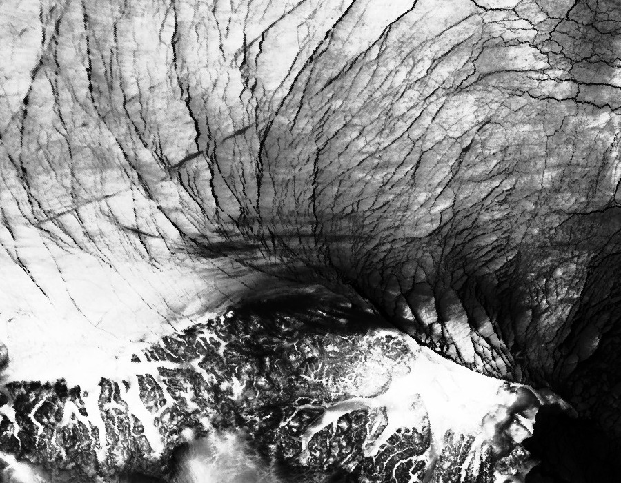
Image 1. 2013-02-20
http://ocean.dmi.dk/arctic/images/MODIS/MorrisJessup/201302200636.NOAA.jpg
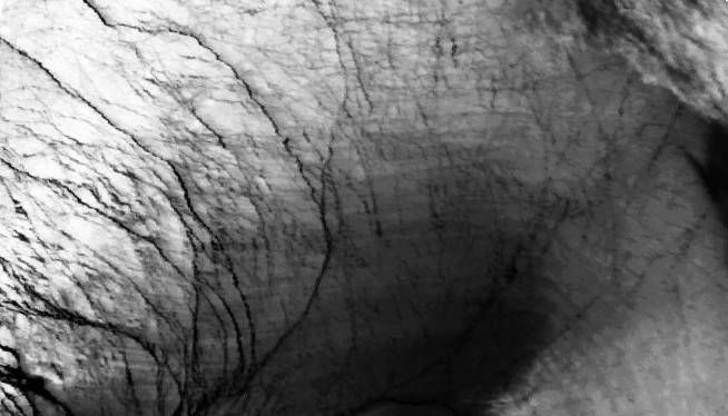
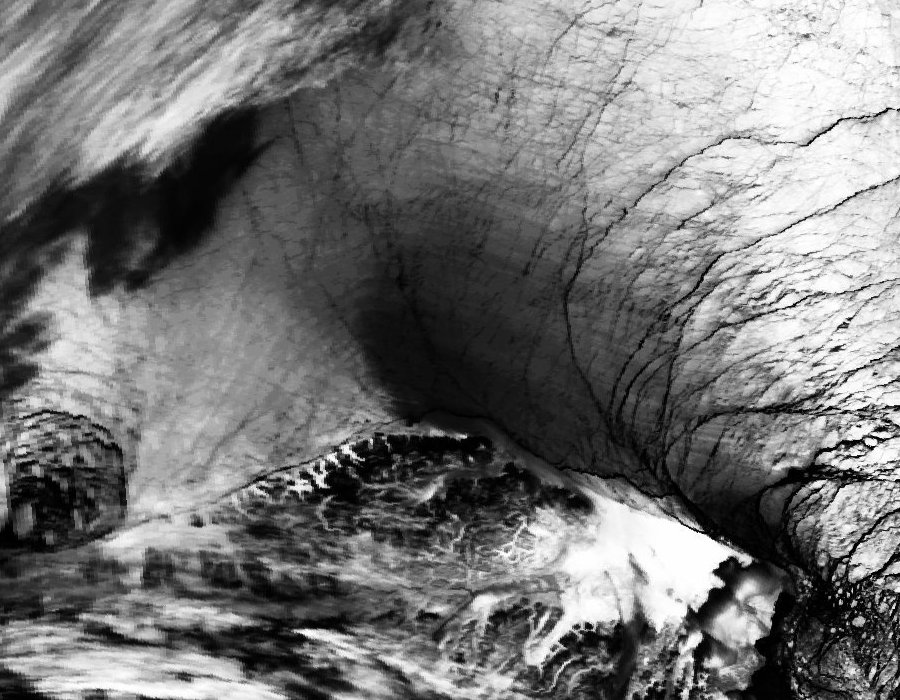
Image 2. 2009-12-30
http://ocean.dmi.dk/arctic/images/MODIS/MorrisJessup/200912300357.NOAA.jpg
This one's in December because there were no NOAA images from that date up to July - I did warn that one wasn't in the same period!

Image 3. 2012-02-15
http://ocean.dmi.dk/arctic/images/MODIS/MorrisJessup/201202150344.NOAA.jpg
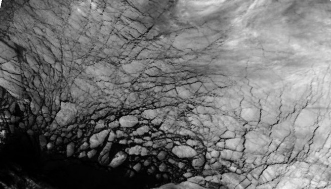
Image 4. 2011-02-20 http://ocean.dmi.dk/arctic/images/MODIS/MorrisJessup/201102200615.NOAA.jpg
What I did to try to make things less obvious was rotate, and mirror the images (as layers in a master image file). But this wasn't enough, Daddybfree spotted it straight away! I should have chosen somewhere less obvious, the patterning around Morris Jessop (northern most tip of Greenland) is very distinctive. But aside from those who knew the location, others seemed to have the same difficulty I had in saying which image was from 2013.
What led to me doing this was a comment at Neven's by Bosbas, who was asking about sea ice patterns in Nares Strait. Incidentally I found that the images for that area seemed to be wrong, they didn't match the geography, and when I checked the previous years my suspicions were borne out, here's a recent image, here's back in 2010. Anyway I got looking at the DMI images and settled on Morris Jessop as interesting from a mechanical point of view, it's a headland sticking out into the flow of ice. If anywhere is going to show changes in behaviour due to the thinning of ice this was a good place to start looking, and the DMI site has several years worth of images of the same area making comparison easy. So I downloaded the images you see above.
I've been seeing claims about winter ice cracking and other behaviour showing the current thinness of the sea ice. But I recall seeing similar features in Environment Canada IR images, back when I used the QuikScat radar satellite as a part of my winter toolbox. QuikScat failed in 2009, but here's a video of it's output.
That shows the hypnotically beautiful pulsing and moving of the ice cap, like a living organism, as the AO shifted from positive to negative index. The bright white is multi-year ice, greys are first year, images fail during the summer as humidity rises. In those images, and the IR images, massive cracks were often seen to open up over hundreds of kilometres within hours in response to wind forcing. So gut-instinct alone meant I haven't included such claims in any of my posts on the situation this year or prospects for next year. I'm simply not convinced that in winter behaviour, as seen in IR images, I'm seeing anything unique to recent years when compared to the pre/post 2007 era.
But with the DMI images I could try comparing a few years. Once I'd downloaded some dates in four years I looked at them to see if I could justify recent changes, the best way was by trying to put them in order or at least name the most recent. Despite knowing full well what the most recent year is I couldn't honestly claim to be able to explain why that should be interpreted as the most recent year. Indeed, simple arguments, like amount of open water would give me the wrong answer. And as for cracking due to thinner ice - they all look like elephant hide! To be fair 2013 and 2012 could be grouped together as having wider leads (cracks), but I'm not sure whether that indicates weather or ice conditions.
So in the Morris Jessop region I was forced to conclude that there was no clear evidence of changes to the ice pack's appearance in satellite IR images caused by the recent changes in the ice pack, or the record low of 2012.
This doesn't mean there aren't changes elsewhere and at other times. If you play the same game with sea ice concentration over the East Siberian Sea low concentration anomaly of July/early August 2012, that would stick out as exceptional in any series of images from the same time of year. I've been watching the ice since 2007, and that was really weird! Furthermore it can clearly be taken as a sign of very thin ice. But so far this winter nothing I've seen in IR images of the pack has struck me in that way.
PS. You can find QuikScat's replacement ASCAT here. Select a past date, and Arctic to see the sea ice. Two things to note: First the agreement between FYI/MYI as seen in PIOMAS and DAM images. Second bright spots in mid latitude are around cities, these are due to reflections of the radar signal from right angles in buildings etc in urban areas.
6 comments:
Chris - I kind of figured which way you were headed and agree. It's the reason I commented that I didn't see anything "ice-shattering" in the images.
Given that we're still close to hitting the winter maximum ceiling for SIE every year, it should be difficult to see significant changes in a top down view.
And since many high latitude lakes freeze over completely in winter, then melt out completely in summer, winter extent can be a very unreliable predictor of extent at minimum.
Man, was I way off with the #3 (2012)! I was guessing if you had taken some early 2000s photo of fast ice movement. The polynya was a give away of the place. I just ordered these according to brightness imagining darkest to be latest. But on the 2012 image there must be way colder temperatures or maybe thicker batch of ice passing the Kap Morris Jessup exit.
Kevin,
I agree completely. We're already seeing some winter oddities, like the repeated low ice in Barents. But within the pack I think it will be years before we start seeing really odd behaviour.
Jyyh,
At face value that's a reasonable way to approach the problem. But IR images are a negative - colder is lighter, darker is warmer. That's so that the cold tops of cloud stand out.
Thanks for a cool puzzle Chris!
DaddyBFree
Chris,
Thank you for the explanation - and I can just be a littlebit proud, I had selected #1 as the one from 2013.
Cheers, Bosbas
Daddybfree, Bosbas,
Anyone who spotted the region and the 2013 image pays more attention to the ice than I do. With a bit of thought I'd have got the north coast of Greenland, but I wouldn't have got the year right.
Kudos is due. :)
Post a Comment