First the PIOMAS Main Series, I use that term to differentiate from the gridded data I predominantly use. The main series being the numbers available from the PIOMAS public website, here. The timeseries of the daily minimum volume is shown below.

The interruption to the long term exponential decline period is strengthened by summer 2014. However by 2014's minimum the increase from the minimum of 2012 is 3.137k cubic km, of this increase, 1.719k cubic km is due to 2013, a lesser 1.418k cubic km is due to 2014. So 2014 is not the whole story, 2013 played a greater role.

As shown in figure 2 above, 2014 has seen the anomalously strong spring melt typical of post 2007 years, but strongly exhibited after the 2010 volume loss event. In 2013, a year of poor melt, before the summer season events started with a robust spring melt despite poor weather. I consider that the muted spring melt of 2014 is probably due to increased volume in the Central Arctic, which I have shown to be a major regional player in the post 2010 spring melts (link), in 2014 this has been combined with poor melt weather.
Referring now to results from the PIOMAS gridded data, figure 3 (below) shows a stacked plot of volume contributions from five thickness bands for the whole of the PIOMAS domain (can be considered 'all Arctic').

Looking from left to right. The long term decline of the thickest ice can be seen (3m and above, purple and light blue). Note that this is for September, prior to 2007 ice over 3m thick was a major factor even at the end of summer. Also one can see a small increase in ice 1 to 2m thick (red), with a commensurate decline in volume from ice 2 to 2.9m, this was due to ice thinning at the end of summer as the whole pack moved to thinner ice.
Then in 2007 there is a step drop in volume whose effects remain with us even through to this September, that was a result of unusual weather in 2007 acting upon an ice pack weakened by decades of attrition from anthropogenic global warming. In 2010 another volume loss event cleared out the thickest ice setting the stage for further declines that culminated in the 2012 area/extent crash, also ushering in a period of unusually aggressive spring melts as discussed above.
My point in revisiting all of this is to stress the impacts of 2013 and 2014's poor melt summers. Ice state is now at a point similar to the years 2009 and 2008. With the extra volume in the Central Arctic, the transport of older thicker ice into Beaufort and through to Chukchi (Pacific sector) will buffer those regions against anything but a 2007 style weather driven crash. For some years, until this volume pulse works through the system, spring melts will be less aggressive, and melt in the Pacific sector of the Arctic Ocean will not be as aggressive as in some recent years, so repeats of 2012 are now rather unlikely, probably for much of the rest of this decade (in my opinion).
The following graph is one I've kept using for the last two years. It shows ten day increments in volume and is effectively the rate of change of sea ice volume, the post 2007 years are shown. Hope the large size works in people's browsers.

In figure 4 2014 is shown in red, it can be appreciated that the differences are actually small, volume losses have been a similar order of magnitude to other post 2010 years throughout the melt season. This curve being largely driven by an invariant factor for each year; solar radiation. Weather merely modulates this factor.
I have recalculated this plot as anomalies from the average ten day rate of change for 1980 to 1999 to show changes from that past baseline and highlight recent changes.

Figure 5 clearly shows the spring melts as being larger than in the past (more negative anomalies), however 2014 is seen to be a weak spring melt, especially when compared to 2012 (orange). After 1 July the losses become less than the average (more positive anomalies), and 2014 is seen to have the highest anomalies (weakest late summer melt rate) of any post 2007 year.
****
As usual, in introducing the breakdown from PIOMAS gridded data here is the map-plot of grid box effective thickness.

The large mass of blue is ice over 2m thick, however also bear in mind the mass of darker red surrounding it. Note that ice in the 0m category is not likely to represent real ice, as can especially be seen around the coasts (which is why PIOMAS thickness neglects grid boxes below 0.15m thick).
The contrast with 2012 is striking, as can be seen in figure 7 below, sorry I've not got the time to do a blink comparison right now.

In recent years, by September most of the volume is in the Central Arctic, this is the case this year. So the general picture painted in my August PIOMAS post where I noted that "78% of the total PIOMAS volume increase from 2012 is from grid box thicknesses between 2.0 and 3.9m thick." The thickness distribution has thinned by September, but the take home message remains that the Central Arctic holds almost all of the extra mass of ice. This can be appreciated by looking at the timeseries of regional volumes in figure 8 below.

Fig 8. Regional volumes from PIOMAS gridded data. NB the scale for Central Arctic is on the right vertical axis due to the dominance of Central Arctic volume.
I've also taken the time to update my calculations from PIOMAS of percentage open water formation as a function of April thickness. The following graphs show the result of calculating the percentage of area in April for a given thickness that becomes open water by September.

In figure 9 (above), all available years are shown, with earlier years darker blue and later years lighter, 2014 stands out in red. The plot shows the increasing open water formed as ice thickness in April goes below 2m thick. In recent years there has been erratic formation of large percentage open water for thicker ice, this is caused by there being fewer grid boxes with thicker ice, and the large inroads of open water into the Central Arctic region, notably in 2012 as will be seen in the following graphic.
2014 is still in with 'the pack' and at thinner grid box effective thickness shows behaviour similar to recent years, for example, taking 1.3m thick and moving up the graph the mass of plots transits from darker to lighter blue. This plot is really only shown to give an idea of spread, the useful detail is in figure 10 below.

Figure 10 (above) has the decades out of order, sorry, but once you've got round that: In the 1980s thicker ice showed the lowest open water formation, with the 2000s and 1990s producing marginally more open water formation than the 1980s (this may not be statistically significant). The real change comes in the post 2007 period (here 2007 to 2012), where the entire curve starts to lift upwards. This lifting is the start of the transition to a seasonally sea ice free state.
I have previously calculated the long period averages for such graphs for various seas, here is the Beaufort Sea.
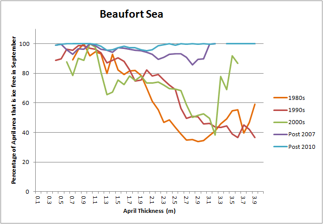
In the Beaufort Sea the plots are less tidy than for the whole Arctic, but the principle remains. In the 1980s and 1990s only half of the ice over 2m thick melted out, keeping the orange and red curves from 100%, down around 40%. Then in the 2000s thicker ice started to melt out for the same reason as in figure 9 this created large spikes as there was less thicker ice to melt out. After 2007 the character of the curve changes, it cleaves close to the 100% level because virtually all the ice of all April thicknesses had melted out by September.
Now, referring back to figure 10, it can be seen that in 2014 the behaviour of thicker ice was more like a pre 2007 year. There was so much thick ice in the Central Arctic, and the weather favoured ice survival, so hardly any thick ice melted out to reveal open water. However whilst this was the case, between 2 and 2.6m and between 1 and 1.5m 2014 was more like a post 2007 year.
For completeness, as these have been in all of my summer status posts, here is the thickness distribution plot for the whole PIOMAS domain. I don't think that there is much to be said about it that wouldn't be labouring the point.

In summary: The extra volume in the sea ice system is massive, in my opinion it removes the chance of a 2012 type crash, leaving only the chance of abnormal weather to remove this mass of ice within a few years. The linear trend of volume loss in the Central Arctic from 1995 to 2012 was -344 cubic km/year (+/-36 cubic km/year). If years with weather not conducive to melt do not become a regular occurrence and the preceding typical summer weather reasserts itself, then the current volume gain of 3137 cubic km would take 9 years to remove, based on the assumption of linear trend losses. However a strong winter export into Beaufort/Chukchi/East Siberian Seas, or through the Fram Strait can be expected to reduce this significantly. That noted I think that the volume gains of 2013 and 2014 have severely reduced expectations of a virtually sea ice free state by 2020.
All of this is separate to my recent post and activity on the Sea Ice Forum about a slow transition. In fact this complicates the situation for me. Another crash this year would have been more helpful to my case as we could have seen whether Arctic Ocean volume in April was again around 19k cubic km. As things stand I will have to wait some years to see if, as I expect, once again the Arctic Ocean Winter volume seems to stall at what one would expect for ice around 2m thick. However I do expect that in years to come April volume will once again start to level at the volume expected for around 2m thickness. In a similar manner, whilst the increase of volume suggests that spring volume loss will be more muted in recent years than in 2010 to 2013, once this pulse of volume works through the system I expect that this phenomenon will also re-emerge.
On the subject of the 'Slow Transition' argument, I will be returning to that in a couple of upcoming blog posts. But over this winter any 'status' posts will be as and when needed, not every month.
The derived sea ice volume data I calculate from PIOMAS gridded data has been updated, apart from daily volume (gridded product not updated), it is available here. This data will continue to be updated over the winter, regardless of whether it is addressed in a blog post.
15 comments:
I also recommend a figure with the volume loss between first of may and 30th of september ( the whole saison) per year. http://www.dh7fb.de/noaice/vloss2k.gif
The statements about the trend slope of the ice volume overestimate the accuracy due to the very strong autocorrelation I'm afraid.
Great post, Chris. I've linked to it (twice) in my latest PIOMAS update.
This is a valuable analysis of volume trends, putting 2014 in context of recent years. Might have further comments after perusing the volume anomaly and thickness band charts; just one for now re: "Another crash this year would have been more helpful to my case as we could have seen whether Arctic Ocean volume in April was again around 19k cubic km." Isn't it more illuminating to see whether April volume returns to about the same level following both a year with a minimum near the trendline (2013) and well above it (2014)?
NJSnowfan,
Scatter plot of Chapman long series of sea ice extent (annual average), and the long AMO series. 1950 to 2007, because the Chapman data stops in 2007.
https://farm6.staticflickr.com/5610/15465525056_7d61b3ccbf_o.png
Taking the 1979 to 2014 period and it looks like there may be a relationship (using NSIDC extent). But that is presented with the problem that the 1930s +ve AMO was of a similar magnitude to the recent +ve, yet did not cause as great a recession of ice.
Johannessen 2008, "Decreasing Arctic Sea Ice Mirrors Increasing CO2 on Decadal Time Scale."
http://farm7.static.flickr.com/6189/6159788844_e2509273a8.jpg
Notz & Marotzke, 2012, "Observations reveal external driver for Arctic sea-ice retreat"
http://farm8.staticflickr.com/7058/6993704168_03751afb94_o.jpg
Yes the AMO plays a role in the Arctic, and a non negligible role. But it is not driving the sea ice loss since 1995. Human caused global warming, with CO2 being the greatest factor is causing the loss of sea ice.
Frank,
Thanks for explaining why the '+/-36 cubic km/year' is too tight. It doesn't affect the basic argument. I could take the difference between 1995 and 2012 minimae and calculate an average yearly loss over that period, then arrive at 7.5 years to remove that volume, before conceding that it is probably going to be somewhat quicker than that.
Thanks for the graph of May to Sept losses. Due to the shifts within the seasonal cycle (spring melt vs late summer melt) I haven't considered it a graph I would include. But readers can check out what you have posted.
Iceman,
You are probably correct, but this way means a longer wait, whereas a succession of repeats of 2012 would have given a quicker demonstration.
Thanks Neven,
Commenting at your blog now.
Chris, of course you are right, the time shift of max/min is not included if one takes the fix data 1st of may and 30th of september. Here is the full record taking the max of the year - the min. of the year. The linear slope of the loss per year is +0.057+-0.037 tkm³/year with no autocorrelation. I've included a 11 year smoothing. http://www.dh7fb.de/noaice/vlossfull.gif
Anyway: in 2014 we see a return of volume-loss to the average of the years 1979-2006. The record of yearly losses shows it better because one avoids the "trap" of the strong autocorrelation of the volume data. For the pure volume data I didn't find a method to remove this effect, so I think it's better to look at the loss-data which are not autocorrelated. Thanks for your interesting analysis of the piomas-data !
Thanks Frank,
I too had noticed the drop to a summer melt more typical of the 1980s or 1990s. Thanks for the further graph, and thanks for prompting me that I need to read more about autocorrelation. So I can properly consider it when applying statistical models designed for random data.
NJSnowFan,
If you are making a substantive point that the AMO is responsible for the 2013 and 2014 melt seasons then you are not trolling, you are contributing.
The problem is I don't think you are contributing. There is no need to point me to the papers showing a role for the AMO, I've read some of them and have stated that I accept it plays a non-negligible role.
I posted long data series scatter plots showing no relationship between AMO and sea ice. That doesn't refute small local impacts (local in time) but it trashes the claim that the AMO drives sea ice loss. I also point out the problem between the 1930s +ve AMO and the current phase with the marked different impact on sea ice. You ignore this, as is evident when you link to your 'Art Chart' taking the subset of post 1979 years and the AMO rise coincident with that period.
I also post graphics from two papers (cited above) that show a strong role for CO2. Yet you say you 'feel' it's mainly the AMO and/or AO. I'm sorry but feelings do not cut it. Keep your feelings on Twitter (such is the currency there) and on science blogs stick to the evidence.
So far I am unimpressed by your evidence and would suggest that rather than post further diversions you should start by addressing the two issues I have raised.
1) The different sea ice response to the similar magnitude +ve AMO phases of the 2030s and the 2000s.
https://farm6.staticflickr.com/5610/15465525056_7d61b3ccbf_o.png
2) The lack of relationship in scatter plots of AMO and sea ice using long term data. And how this contrasts with the relationship between CO2 and sea ice for a similarly long period.
Johannessen 2008, "Decreasing Arctic Sea Ice Mirrors Increasing CO2 on Decadal Time Scale."
http://farm7.static.flickr.com/6189/6159788844_e2509273a8.jpg
If you don't feel these are important issues with your position please explain in detail why.
I will have my response to your response in time on the AMO/AO.
in the mean time
Not sure if you have seen these yet 1964 -1970 sat Sea ice maps. N and S hem
ftp://n5eil01u.ecs.nsidc.org/SAN/NIMBUS/NmIcEdg2.001/
Yes, seen those plots.
Here's some Danish charts that cover the 1930s.
http://brunnur.vedur.is/pub/trausti/Iskort/Jpg/
Here's the state in 1937.
http://brunnur.vedur.is/pub/trausti/Iskort/Jpg/1937/1937_08.jpg
"My point in revisiting all of this is to stress the impacts of 2013 and 2014's poor melt summers. "
You could flip your thinking on this which would allow you to look at the problem in a different way. It would be supported by this recent reconstruction of arctic atmospheric circulation.
http://www.the-cryosphere-discuss.net/8/4823/2014/tcd-8-4823-2014.pdf
What this paper is saying is that 2000-2012 ( and particularly 2007-2012) have stood out as years with 'weather' highly condusive to melt in comparison to long term averages. So we might see 2013 and 2014 as a correction back the 'normal' after an extended period of anomalous years.
If you are inclined to think of this inter annual variability as noise then it might be worth pinpointing exactly where 'normal' sits and leave one less open to surprise.
NJ Snow Fan,
Of course a small boat could have made it through amongst the floes in summer.
Those maps were compiled using the best available data and the regions with data are marked in red. But are you really claiming conditions in the late 1930s were anywhere near recent years?
Hello HR,
Thanks for the link to that paper.
It is possible we're seeing a return to an earlier regime. However Bluthgen et al "Atmospheric response to the extreme Arctic sea ice conditions in 2007" seems to me to provide reason to suspect that the arrival of dipole summer conditions between east and west Arctic from 2007 onwards was not a coincidence. There may be a feedback caused by anomalous open water off Siberia driving lows and the attendant high over the Central Arctic. Although I really don't have a strong handle on this.
This is not to say that Dipole like conditions have only appeared recently. Zhang et al "Recent radical shifts of atmospheric circulations and rapid changes in Arctic climate system" noted a shift to dipole like tendencies after 2003. However as the paper you have linked to noted, the clustering of 2007 to 2012 does seem to be unusual.
We'll should know better by 2020(ish) whether there has been a return to a new normal, or whether 2013 and 2014 are deviations from a new normal.
It seems unsettled to what extent recent atmospheric conditions are 'natural' or 'forced, i agree that things were generally moving in the direction of forcing playing a large role but putting the present conditions into some longer term perspective. The problem seems that the paper I linked to still allows both positions ( largely natural or largely forced) to be plausible, very unsatisfactory :(.
I think this is important because it impacts what we might think are the major causes of the recent declines and also how things will develop in the future, possibly even the direction of change for the coming years. A possible exemplar for this situation might be ENSO where following a period of extended and strong El Ninos in the 1980 s and 90 s a slew of papers came out supporting the idea this was possibly a new forced situation. To have this followed by the longest stretch of non-ENSO condition in the recent record might make one wonder about those earlier predictions. Of course 2 years of reversed conditions in the arctic are still to early to hang new predictions on.
It's disappointing you seem to come to the same conclusion i did, that we'll need a few more years in order to sort this out, I was hoping for some answers quicker, i'm greedy for answers!
HR,
"I was hoping for some answers quicker, i'm greedy for answers!"
I'm happy to see I'm not the only one with with such a childish impatience. ;)
The ENSO example you give reminds me of the AO in the early 1990s, when a series of papers identified the AO +ve period as due to global warming (stratospheric cooling driven, if my memory doesn't fail me), then the AO went more neutral - back to the drawing board!
It's like watching waves coming in and trying to judge whether the tide is coming in or out. Our calculations based on the moon say it is coming in, but sometimes large ships steam by throwing more noise into our observations. Our problem is we get one wave a year and the ships pass every decade.
Post a Comment