The regions have been remapped by Michael Yorke (thanks Michael), I'm satisfied that they are closer to the CT Area grid of regions than my previous rough method of re-gridding so have recalculated all data. The differences are generally small, but especially as ice volume in a region reduces towards zero, there were some large percentage errors in certain regions in the Arctic Ocean. My calculation of regional breakdowns of PIOMAS data are available here. All of the regional graphs on this post are based on the data copied into those CSV files. And as usual, thanks to Dr Zhang and the team at the Polar Science Centre for making the gridded data available.
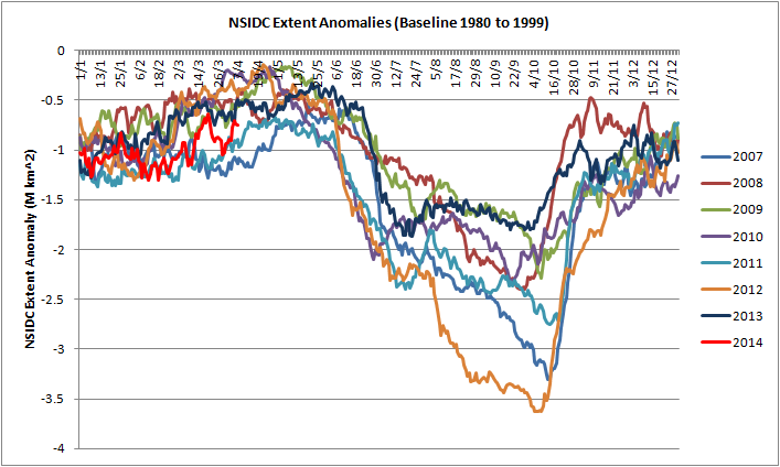
NSIDC Extent anomalies (baseline 1980 to 1999) show that throughout the winter, regardless of volume considerations (which mainly affect the Arctic Ocean), NSIDC Extent has been low.
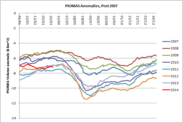
PIOMAS Volume anomalies calculated from the main PIOMAS daily timeseries of volume (baseline is 1980 to 1999) show that 2014 is one of a set with the other post 2010 years. Now that most of the 2013 volume pulse has been lost, anomalies are tracking 2012 and 2013. Whether 2014 follows the other post 2010 years in exhibiting a spring volume loss anomaly remains to be seen. I think it will.
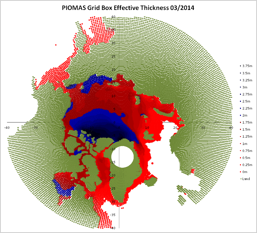
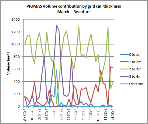
PIOMAS grid box effective thickness shows that much of the pack is under 2m thick (grid box effective thickness) - blue regions are 2m thick and over. Note that much of the extensive ice shown in the Atlantic sector is in the category <25cm thick. As can be seen from observational satellite data there is not continuous ice in all of that region. The PIOMAS thickness graph, here, omits ice under 15cm thick, which would remove a lot of the ice I've plotted in the <25cm category. Grid box effective thickness is the thickness to which a sub grid thickness distribution is fitted, as I understand it, in such regions it allows the modelling of scattered floes.
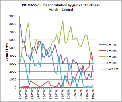
The PIOMAS March volume broken into regions shows that while the volume pulse from 2013 has left a trace in the Central Arctic, elsewhere volume is in line with variation in recent years. Indeed even in the Central Arctic the remnant of the 2010 volume pulse is now appearing as a normal 'wiggle' on the trend, in line with similar small upturns seen in past years. Despite such wiggles the trend has continued down, I expect it to continue down because of the self-acceleration that is causing volume loss.

And continuing the graphic used in the February Gridded PIOMAS post, the short duration of the overall increase in volume over 2013 can be seen. As will be seen further down in the post, and as I've mentioned in my previous post, its effects will probably be regional and limited.
I have calculate the difference in volume between January 2013 and March 2014 and a year previous for each of the stated months. The result is plotted below, click to enlarge. April 2013, just before for the volume pulse began (Mid May - see above) is marked in black, March 2014 is marked in red, this is done to highlight the start and end of the volume pulse.
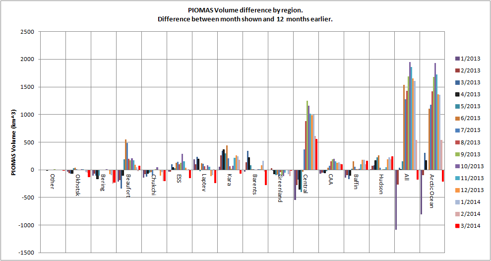
The greatest contributor to the overall volume gain is from the Central Arctic region, where after July 2013 started to fall behind the strong losses of 2012 (a record year for area and extent), similar behaviour can be seen in the Canadian Arctic Archipelago (CAA). In the peripheral seas the volume increase between 2012 and 2013 is broken as volume drop to low levels in both years during the mid summer, this also applies to Hudson Bay, which is also typically ice free in summer. However the small contributions to the volume increase over 2013 from seas outside the Central Arctic region is still enough to pull both 'All' PIOMAS domain volume and Arctic Ocean (including CAA) volume substantially higher than the Central region alone. This was a general volume increase, not just in the Central region.
But by March 2013, from Beaufort to Barents all peripheral seas show volume lower in March 2014 than it was in March 2013. This means the volume gain of this year is not an impediment to melt this year in those seas.
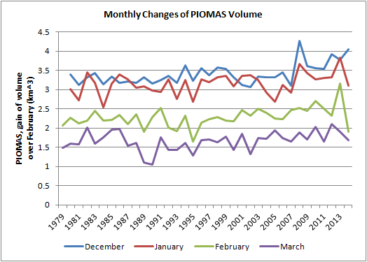
The remarkable nature of what has happened to the volume pulse of 2013 last month can be appreciated by looking at the monthly change in volume. Due to growth/thickness feedback there is a general increase in volume gain over the months from December to March, this is strongest in recent years for the early winter (Dec/Jan) but is seen to begin in the mid 1990s in the late winter (Feb/Mar), this is relevant to the hypothesis of Lindsay & Zhang (discussed here).
What really stands out in the context of recent years is the massive lack of volume gain in February 2014.
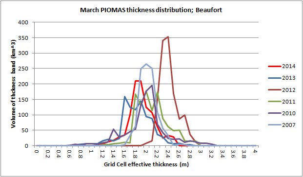
As usual here are the thickness profiles for three regions within the Arctic Ocean. The Beaufort Sea and the East Siberian Sea (ESS) taken as representative of the Alaskan and Siberian sectors, and the Central Arctic. A picture paints a thousand words, so I'll spare you mine...
Beaufort Sea.
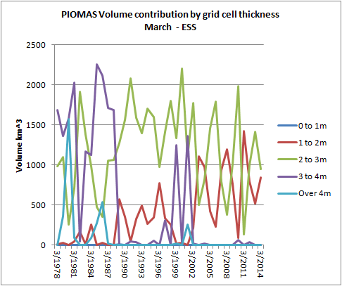
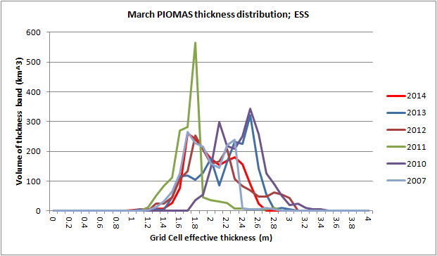
East Siberian Sea.
Central Arctic.
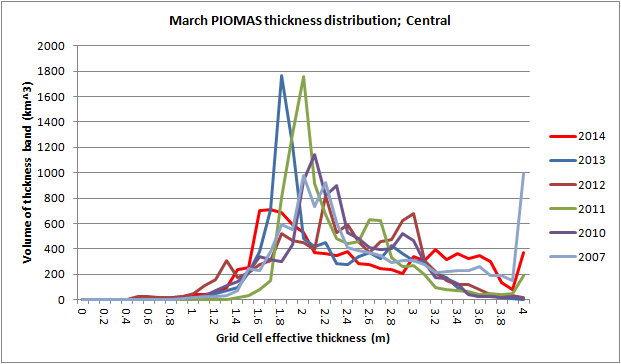
From my reading of the plots above I expect a normal melt season, in the context of 2010 to 2012, but not as low as 2012. As discussed in my previous post, I do not expect spectacular area/extent loss in Beaufort and Chukchi because of what I see as a significant influx of multi year ice from the Central Arctic region, however this could lead to volume losses putting us back on the pre 2013 trend, possibly below. But I expect large losses from the ESS to Bering starting from the period of the spring volume loss anomaly - May and June. All of which depends on the weather.
I don't expect 2014 to beat 2012, but I do expect a more exciting year than 2013.
PS.
I've added a thickness distribution plot for all PIOMAS domain below, sorry for not including it in this post.

6 comments:
Why don't you have a thickness distribution plot for the "Arctic as a whole" like you normally do?
I was more concentrating on the regional nature of the volume pulse as its remnants are now. But I'll draw it up and post tonight for you.
Thanks, Chris.
Nightvid,
Done, scroll up a bit. ;)
The peak thickness is at an all time low, so why don't you expect 2014 to beat 2012?
Because whilst I've found the decline in volume (or thickness) explains a lot of the trend of decline in area (or extent), small variations of thickness have little predictive power for the coming melt season.
The ice is much thinner than 2012, but 2011 and 2013 were thinner than 2012 - we can ignore 2013 (weather driven failure to melt). But that leaves the question of why 2011 didn't do what 2012 did, it matched 2007, but didn't beat it. Note - the high peaks in 2011 and 2013 are symptomatic of a lot of FYI thickening thermodynamically.
My reasoning may still be affected by my previous expectation that the volume pulse would carry on to this year - which hasn't happened. But my gut feeling remains that we won't beat 2012. A part of that is the MYI in Beaufort, a part is my finding that thickness loss explains the trend in area/extent, not variation from the trend as mentioned above.
Don't get me wrong, I'd love to see 2012 beaten, that would be exciting. My gut feeling is that it won't be. That could change, I'll think about it.
Post a Comment