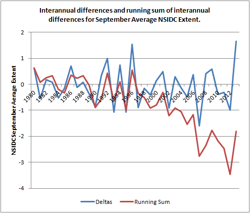
The interannual differences for NSIDC September average extent have been calculated as the difference between the year stated and the previous year. The the running sum of these differences has been calculated. Clearly in the mid 1990s something happened that lead to following years showing a declining running sum. As to what that was I will blog again in due course (those who frequent the Sea Ice Forum will already be wise as to where I'm going with this).
However before I go into more detail about a certain set of papers in upcoming blog posts, I want to outline a change in terms of the PIOMAS data.
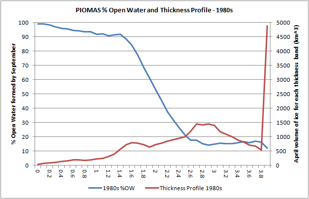
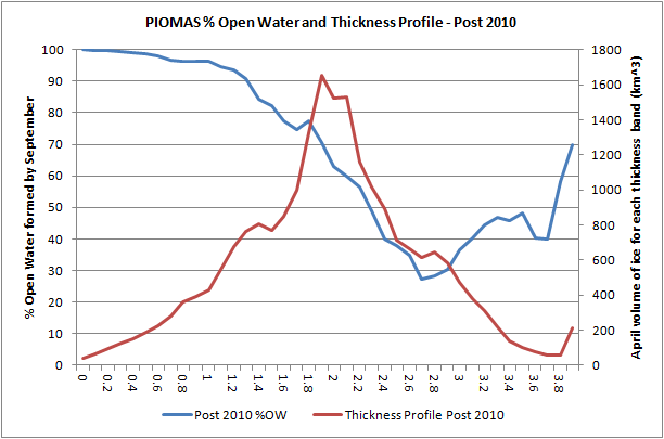
The following graphics are all derived from gridded PIOMAS data, available here. All of the graphs show the percentage open water (%OW) formed by September as a function of April thickness of ice (blue trace), and the April thickness profile (red trace). For legibility I've had to size the graphs such that on some the right hand axis is obscured, to see the image in full click on it, note that the scales on the right hand axis change with each plot as total volume decrease. The period covered by this data is 1980 to 2012, I've not got round to calculating for 2013 as yet.
Considering the first graph, in the PIOMAS data the average amount of open water formed for grid boxes of around 3m thick was about 15% of the April area of ice. In other words for ice around 3m thick in April about 15% melted away during the summer, with 85% surviving. Also while there was a peak of thickness at around 3m thick, much of the volume was taken up by ice in grid cells of 4m thickness and over, hence the red trace shoots up at the right of the plot.
Crucially the bulk of the volume was outside of the portion of the blue trace where there is a rapid transition from little ice melting, to most of the ice melting.
In the 1990s the situation is very similar to the 1980s, but the total volume of ice 4m thick and over has declined, and the peak at 2.9m in the 1980s has now declined to 2.6 m thick, and is entering the region of the %OW plot where a rapid transition to large percentage open water formation is found.

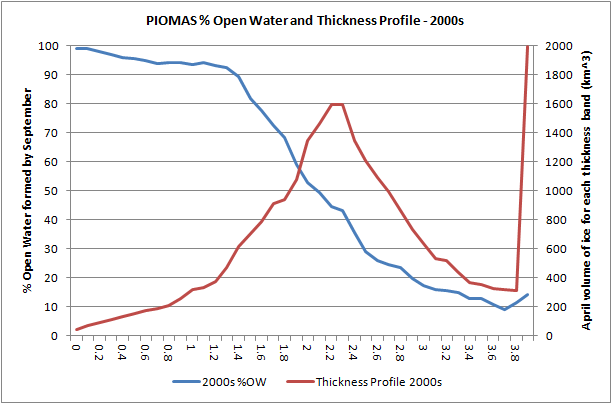
The 1990s is of course the period in which, as shown in the first plot of this post, the cumulative sum of differences begins to slew strongly negative, in view of that it is worth comparing the plot of the 2000s average with the 1980s.
In the 2000s there is still a large peak of ice over 4m thick, but the peak below 3m thick is now greater (considering the integral of volume under the red line). Furthermore the peak, having shifted from around 3m in the 1980s is down to about 2.3m in the 2000s, this thinning having brought much of the pack into the region of transition in the blue %OW plot. Here we begin to see a major factor in the decline of cumulative sum of interannual difference shown in the first plot of this post.
For the average of years after 2007 the peak has dropped further to about 2m, and is firmly in the region of transition in %OW from most ice surviving to most ice melting out in the summer.
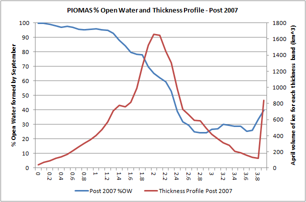
Choosing 2010 as significant due to the 2010 volume loss event, the thickest ice is seen to be severely reduced and as a result of the low volumes involved greater amounts of thicker ice are melting out by September causing the %OW plot to lift at the right hand side. This is similar to behaviour seen in the peripheral seas of the Arctic Ocean where transition to a seasonally sea ice free state has already happened, more here.
Scroll up to the top of the preceding set of graphs and place the mouse over the %OW plot (blue line) at around 1m thick, there's an inflection here. Now scroll up and down keeping the mouse in the same position as a marker of horizontal position, notice how the inflection moves very little (to the left and right). Try the same at around 2.6m for the inflection above the region of rapid transition. There is movement, but in view of the greater changes in the plot of thickness profile (red line) there is very little shift. This suggests to me that the region of rapid transition from small %OW formed to large %OW formed is due to processes in the melt season being modified by the shift in the overall thickness distribution.
And that's why I thought it worth posting these graphs, the bulk volume is shifting downwards and enabling greater open water formation during the melt season due to there being thinner ice, which when subject to normal levels of thinning reveals open water. And when open water is revealed the ice/ocean albedo feedback can get to work.
7 comments:
Doug Cotton,
Pseudo-scientific bollocks in no way related to the post or to the main topic of this blog. Comment deleted.
Is the increase in %OW formed from thicker ice (3.5 - 4+ meters) due to ice entering the Beaufort sea in the spring and then melting in the southern part of the Gyre?
Nightvid,
Hope this link works - should be April thickness for 2013, see here.
Taking the region of thickest ice - this is restricted to the central region off the CAA and North Greenland - that doesn't melt out to open water. So that can't contribute to the %OW figure as open water in September. Leads etc within the pack don't count, they're covered by the sub grid parameterisation, not as open water in the monthly average.
The export into Fram and Beaufort doesn't typically contain grid boxes that thick, even later on in April. Not in recent years anyway.
However very thick ice forms by ridging off Severnya Zemlya and the Siberian coast near the Bering Straits, it always has done. In April 2013 it formed in those two areas, in April 2012 it only formed off the Bering Siberian Coast. I think the increase in %OW melt in thickest ice is because the thicker ice contains proportionately more of this ridged ice in regions that in recent years always melts out.
The Beaufort export wouldn't explain it because the calculation of %OW is dependent on the thickness in April, in recent years the ice just hasn't been that thick in Beaufort.
More thickness plots here.
>"Considering the first graph, in the PIOMAS data the average amount of open water formed for grid boxes of around 3m thick was about 30% of the April area of ice."
Should that be about 15%? or am I reading the graphs incorrectly?
Crandles
Yep, my error, you're right. which means you do get the graphs.
Thanks, corrected.
Thanks Chris,
So the distribution is changing so that more of the ice is closer to the thickness that corresponds to thermal equilibrium thickness in April. Those thicknesses have been getting thinner.
The shape of the melt out curve has been moving upwards particularly on the right hand side. I would attribute this to what is happening nearby - if there is lots of thin ice nearby then a thicker slab of ice will melt out. If there was some way to account for that, then the proportions that would melt out from initial thicknesses might look even more similar than your blue lines.
Summarizing what happens to the mode thickness near the thermal equilibrium thickness:
Decade,Thick,MO%,MO% if use previous graph
80s 2.9m 15%
90s 2.6m 26% 18%
00s 2.3m 44% 38%
>07 2.1m 63% 51%
>10 2.0m 62% 64%
Most of the big increases do seem more due to the thickness distribution changing than the upward movement in the blue line.
For future movements the blue line hasn't moved much and might be moving down rather than up? But perhaps that changes when lots of open water appears near the ice we are considering?
Thanks for doing this much better and much more completely than my attempts.
Looks like about 3cm thinning per year in the thermal equilibrium thickness. So in 2024 we have equilibrium thickness of 1.7m and only about 80% of extent melts out? Hmm maybe it is dangerous to try to to extrapolate like that ;)
Crandles,
I discussed the significance of the general upward shift of the right hand segment of the blue lines in this post. A seasonally sea ice free state is when for all thicknesses there is 100% melt.
I agree that thicker ice amongst thinner is a factor in melt. This is probably a factor in the failure of the Beaufort Gyre Flywheel.
"Thanks for doing this much better and much more completely than my attempts"
I've been hacking away at these plots for about a year now, if I'm not making progress I should give up. ;)
The %OW distributions however are a poor predictor of the coming melt season. I've not done the math but I suspect they're worse or not much better than simply using the trend in total volume or Arctic Ocean volume.
Post a Comment