Instead of presenting graphs of the full seasonal cycle, once again I'm using anomaly plots, I explained them earlier in the year but suspect it's as well to go over them again.
Anomalies are calculated as the difference from the long term mean, I use 1980 to 1999 as the common long term mean for the three indices I use, NSIDC Extent, CT Area, and PIOMAS Volume. The long term mean is calculated by taking the average extent, area or volume for the period 1980 to 1999 for each day, this gives a series of 365 values (I neglect leap years), which are a seasonal cycle.
This plot is from earlier in the year, but shows some recent years of sea ice area (CT Area), along with the baseline average. Take 2011's CT Area data, shown in orange, the anomalies for that year are calculated by subtracting the black curve from the orange curve, i.e. for every day that year I carry out the subtraction, easy to do in a spreadsheet.

Anomaly plots are a key way to look at the data, because the small changes within the year, and from year to year are swamped by the massive seasonal cycle. So anomalies can be considered a way of removing the average seasonal cycle to leave the differences. Note that I've used the period 1980 to 1999 because this is a period before the massive changes of recent years. I'm interested with those changes so want to highlight them, it would however be just as reasonable to use a longer period (e.g. 1980 to 2009) or even the full period of data as the baseline average. That would just make spotting small changes more tricky.
I'll start with NSIDC Extent anomalies.
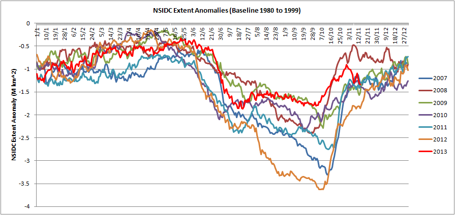
The 2013 anomaly plot is shown in red, from May to mid June Extent was lost at broadly average levels, then after the summer solstice extent fell at a far more rapid rate than the average, such falls are common to recent years. Throughout the summer losses were at similar rates to the long term average (flat anomalies), but the refreeze has happened faster than average (again this is common to recent years). In the last two weeks the increase in extent has been slower than average resulting in a fall in anomalies.
This fall in anomalies is actually visible in the full seasonal cycle plot as a levelling, which reveals it to be a large event. NCEP/NCAR pressure plots show that the pressure over the Arctic Ocean remains below average before and after the event, but there is a shift from a centre of action placing the low pressure average within the Arctic Ocean to a centre of action over the Bering Sea. Bremen AMSRE shows that around November 1st the ice edge grew to fill the Arctic Ocean, 16 Oct, 1 Nov, 15 Nov. It is worth referring back to the above anomalies, note that years such as 2008 to 2011 all show inflections around this time. This is due to the slowing of rate of extent (and area) loss due to constriction by geography (e.g. Bering Straits), essentially the same effect described by Eisenmann et al in "Consistent changes in the sea ice seasonal cycle in response to global warming." PDF. Why it seems to have produced a more marked drop in rate of gain this year I am not sure, this could be related to the coincidental shift in centre of action of the prevailing low pressure anomaly. A centre of action over the Bering Sea may act to reduce ice edge advance into that region by Ekman transport - just a guess.
CT Area anomalies similarly show a slower than average gain during the last week, again looking at the full cycle plot shows this to be a levelling.

I can't add anything about that recent lack of gain of CT Area, but again it's worth noting that after a June drop in anomalies (which happens earlier in CT Area), summer losses were similar to the long term average. To get a longer term context of the change in anomalies see this earlier post.
However a feature common to both extent and area is that 2013 has not seen a drop in anomalies caused by unusual persistence in open water as the ocean vents the heat gained during the summer before freezing can start. This is apparent from temperatures through September and October, the peaks in 2007 and 2012 are due to the relatively long periods of open water during those seasons allowing ice-albedo feedback to warm the oceans, that heat then being discharged into the atmosphere in the early melt season. This has not happened this year, which has been cooler than any other post 2007 year, while clearly remaining warmer than the majority of pre-2007 years.

PIOMAS Volume anomalies are shown below.
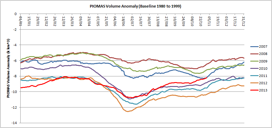
After three years (2010 to 2012) in which a spring (May - 21st June) volume loss far more aggressive than the long term average has played a key role in the melt season, the spring volume loss of 2013 was far less aggressive. However like those years losses of volume later in the summer were at a lesser rate than average (rising anomalies). Now up to 31 October the rate of gain has been greater than the long term average such that volume at the end of October is at the same level as 2007. Indeed looking at net volume gain over September and October 2013 has the highest volume gain for that period of any year in the record.

However this means little for the rest of the season. Taking the volume gain from 1 November to 1 March and plotting each year's gain as a function of the volume gain from 1 September to 1 November reveals no relationship.
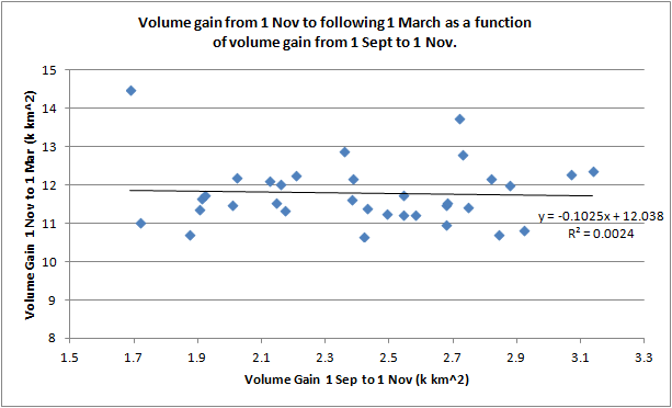
As the early volume gain varies (left to right) it reveals no relationship with the gain of volume later in the season (up and down), resulting in a relatively flat line of fit that explains virtually none of the variance (near zero R2). So reading record volume gains later in the season into the record volume gain over September and October is baseless.
***
I've redesigned my sea ice spreadsheet. It is usable now through to 2020 without running out of space. Thanks to Michael Yorke for contacting me about NSIDC Extent data just as I was pondering the issue of interpolating that data in the earlier years, he persuaded me a simple approach was satisfactory. Pre-1988 there are gaps with data being only available on alternate days, and a long data gap from 3 December 1987 to 12 Jan 1988. The daily gaps have been filled with average of the two adjacent dates of available data. The long data gap has been filled with the average of the two adjacent years for the same date, this is highlighted as grey text as it may have more significance for some uses, but it was the simplest way of guessing a reasonable set of values based on the climatology at the time. That approach is simpler than Michael's initial idea.
Spreadsheet available here for Excel 2007 and later, because it is a complex construction it cannot be interpreted by the Google Docs viewer. Sorry but I won't providing other formats, the data sources are available at the top of this post if needed. The discussion here of how the previous version of the spreadsheet works will help anyone wanting to update this version themselves, this new version uses three named tables as the main data sources.
I am also in the process of reworking the 'VBA in Excel' code I use for PIOMAS gridded thickness data in preparation for rather a large job, when I've finished the tidy-up I'll make the core of that code available publicly in a macro enabled spreadsheet and will blog to help anyone interested get running with it. At present the code is a mess even I find difficult to follow due to constant amendment, and the fact that I'm a lousy programmer.
No comments:
Post a Comment