Key to answering the question of what happened to the thick ice is the question of when it happened. The following graphic is the volume series for years 2006 to 2012.

This shows that the years plotted fall into two groupings, years after and including 2010 are clearly below the rest. This happens from approximately day 115 (26/4/10) to 160 (10/6/10), when the plot for 2010 moves from one grouping to the other. This would suggest that whatever happened, it happened in May 2010. But the numbers show that the process was not as clear cut, yes the largest volume drop, creating the deviation from previous years to 2010 happened in May, but more happened before.
I have broken down the volume loss into 25cm categories, to see what finer analysis shows? The following graphic is from a spreadsheet and shows the interannual differences between 2009 and 2010, i.e. 2010 minus 2009. Rows are months, columns are thickness categories, figures in 1000 km^3.

Firstly I'll dispense with a detail that may look important but isn't actually relevant. From May to August in the categories 1.75m and 2.0m there are large drops. These are due to those categories being high in those months in 2009, relative to preceding years, as they aren't due to change between 2010 and the typical recent state of the ice, as typified by 2009 (an unremarkable year compared with 2010), I've discounted them from the following considerations. It may be thought that it would be best to use anomalies, however I've not found these bring out the details I'm concerned with, and as I'm looking at the cause of the volume drop between 2009 and 2010 directly comparing these years seems the relevant consideration.
I've emboldened the categories I see as relevant, and in the final column is the sum of the emboldened figures. That sum does not add up to the month to month net volume change because of offsetting from some volume gains, but again; I'm concerned with the losses that seem to account for the net interannual volume loss.
Firstly it is necessary to look at conditions prior to the above table. What is notable is that from December 2009 there appears to be a failure of the regrowth of ice over 3.5m thick, this condition persists throughout the winter and is visible on the thickness maps as a lack of the darkest ice area which is typical off the Canadian Arctic Archipelago (CAA). The most reasonable explanation for this is the effects of the Warm Arctic Cold Continents (WACC) pattern of Winter 2009/10.
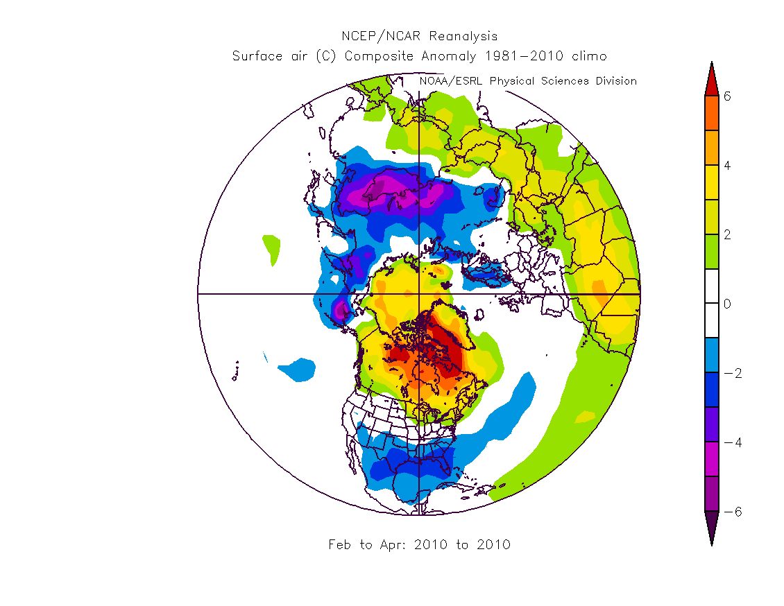
The winter of 2009/10 was characterised by a pattern of warmer than average temperatures across the Arctic with colder than average in a band across the mid latitude land masses of Europe, Asia and North America. This is seen most strongly in February. This was due to the reversal of the polar vortex and influx of mid latitude into the Arctic, with cold outbreaks of arctic air at lower latitudes, a pattern known as Warm Arctic Cold Continents, background here. These warmer temperatures would not cause melt, the anomalies are from a baseline well below zero degrees Celsius. However ice thickens by accretion of new ice at the ocean/ice interface causing sea water to freeze onto the base of the ice, this process is driven by heat flux through the ice, if the surface temperature rises, that heat flux reduces and the ice thickens less. The following graphic shows NCEP/NCAR surface temperature anomaly for February to April 2010, a similar pattern of warm anomalies over the Arctic ocean and CAA was evident back through the winter. The averaging of this graphic omits the large warm anomalies that were present in the Arctic ocean off the coast of the CAA, during occasional months.

Going back to the interannual differences table above, most of the interannual drop in volume from March to June is accounted for by increasing loss of ice over 3.50m thick. As the ice volume of over 3.50m hits zero in July the losses spread down the thickness categories, arguably this is happening in the 2.75 to 3.50m thickness categories in June. This spreading process occurs until September, after which regrowth occurs.
So it seems to me that the volume losses of spring 2010 were caused as follows: The WACC pattern of the winter 2009/10 primed the ice by retarding the formation of the thickest ice, leading to low volumes over the winter. Then warm conditions in the spring caused further loss of thicker ice, these warm conditions were centred over Greenland and the CAA, which may explain why thicker ice in particular was lost to a greater degree than in recent years preceding 2010. These losses of volume spread down through the thickness profiles as the summer melt proceeded.
However as the previous post shows, this does not mean that the ice then recovered in the following years. Again we see a similarity with 2007. Both 2007 and 2010 are weather driven events that leave what turns out to be an indelible impact on the sea ice.
In the first graphic of my previous post I showed how 2007 and 2010 are together with 1981, 1993 and 1995 as a set of years with notably high volume loss. It might seem that this suggests the recent episodes aren't unusual. However apart from 2008, every year since 2002 has shown loss of volume from the previous year, so while large volume loss episodes are not unusual, the earlier volume losses were followed by recoveries. That is not the case for 2007 and 2010.
Leaving aside the possibility of atmospheric feedbacks on sea ice loss, as appears to have been the case in 2007: To dismiss 2007 and 2010 as mere weather driven events is to ignore the crucial fact that the forcings driving sea ice loss are unremitting and are not giving the ice time to recover. As the ice gets thinner open water formation efficiency goes up and weather driven loss events become more likely.
30 comments:
Great posts. Thanks for your work on this.
It seems you think we are in a new regime with less thick MYI.
Is the effect that we now melt a substantial proportion of the thickness of even the thickest ice? Does this mean that thick ice gets thin enough that FYI is frozen onto bottom of MYI in winter to a much greater degree? So the temperature only has to get up to -1.5 to start melting the thickest ice rather than up to near 0. This would presumably ensure a longer melting period for this thick ice which would make sure a substantial proportion of the thickness is melted every year.
crandles
I think it's possible to see the preparation for 2010 going back even earlier than 2009; even when the ice seems to recover from a low year, how long does the latent heat so released take to escape the arctic atmosphere? It seems to me that the heat content of the arctic sea+ice+atmosphere never really recovers from about 2003 onwards.
Perhaps just another element of arctic amplification, that the winter arctic is more reliant than other places on losing its winter heat directly to space, the only place colder.
Nice post.
Simon
Crandles,
I'm working on a study looking at thickness loss from May to Sept, vs initial thickness of ice to see how much thinner ice thins more than thick. I may do this year by year, presenting histograms for each year. But I suspect that the warming will increase thinning in the 2000s.
I'm still pondering how to interpret this in terms of ice mechanisms. I think there's still MYI in there, but it's broken and fragmented. MYI, lacking brine pockets, is more mechanically sound and as I understand it melts at a higher temperature. In spring temperatures are going up, so ice with a lower melt temperatures (e.g. FYI goes first) as you say.
Does this issue explain the volume anomalies?
http://farm9.staticflickr.com/8315/7915990906_b380548eba_o.jpg
What first drew my attention to this issue was the early melt implied by the volume anomalies. Is this younger fresher ice taking a more active role in early melt?
Weather might be suggested to be a player this early in the season - but the same warm anomalies over the same period each year? No, I think the first suspect has to be the common factor, younger ice.
PS - I'll blog again later this week but it seems to me that early melt, such as that anomaly plot implies, is a prerequisite for losing the all ice by September.
Simon,
Yes. This is the culmination of a multi-decadal process of loss of thick ice, as I show the evidence shows that the volume loss has been from thicker multi year ice.
Interesting volume anomaly graph. :-)
From 2005 onwards there is a consistent downslope from approx day 115-140 to approx day 175. FYI frozen onto bottom of thick ice could be giving a larger area that can be melted.
There is then a consistent upslope from day ~175 to day 210-250. Clould this also be explainable in terms of surface area of FYI that can be worked on? Running out of FYI frozen onto bottom of thick ice (happens later each year?) and reduced surface area (increased effect each year starting earlier and earlier)?
My suspicion is that the day 140 to day 170 drop in volume anmalies is due to the ice edge retreating faster than previously during the transition from melt back in the peripheral oceans to melt in the Arctic Basin itslf. Melt in the basin (Siberian/Alaskan sectors) really gets started from around day 160. (It actually starts earlier but seems to be more concerted by June) The period 140 to 170 corresponds to mid may to mid June - checking CT regional breakdown and this is the period that the seas Beaufort/Chucki/ES/Kara/Barents are all ramping up for summer losses proper. I think this negative slope anomaly is more connected with that than with the MYI which is concentrated in the central Arctic.
Perhaps FYI frozen onto the bottom of MYI would impact anomalies, these being differences from mean. But with the small % of MYI and its thickness implying much less heat flux than FYI, therefore less growth; I'm not convinced that the effect would have a significant impact on the anomalies.
If I'm correct then this really puts the post 2010 behaviour into context! It's a staggering advance of volume melt within the season.
Day 250 is around 6/9/XX. Which is as near as damn it the minima. So what does that slope mean? I'll think about that. I've noticed a decrease of volume loss after Jun 30th, but have never come up with a satisfying explanation for it.
We've got gridded thickness data, but within a grid box we can't say how much of the growth of thickness is due to acretion on MYI, or how much is due to thickening of the younger thinner ice surrounding it...
I can't think of a way to cut through our alternate explanations to decide what's going on.
Any ideas?
No brilliant ideas yet, I'll try to continue to mull it over.
If the anomaly downslope was getting earlier each year that would seem to favour your explanation whereas if it stays at the same time of year or gets later then my explanation might be better. I think it is tending to start earlier. Also I think I would also tend to agree with concerns that MYI% is too small for my explanation to be able to explain such a large effect.
I would tend to think that an upslope means the easy to melt ice has been melted out but I would expect that to generally start earlier each year. But there isn't much variation in date of start of the upslope so it seems reasonable to start thinking about surface area?
In later years there is less surface area due to areas already melted out. Perhaps more heat from albedo feedback compensates? If it fully compensated, why is there an upslope at all? If it doesn't fully compensate, why doesn't the start of the upslope tend to start earlier each year?
2006 looks really unusual in having a down slope late in the year. Perhaps that is partly what set things up for 2007 melt?
2006 - volume was low in the winter of 2006/7.
http://www.arctic-charts.net/volume-charts/ThicknessAnomalies/ThickAnom200701.jpg
The widest spread negative anomalies for some years prior to that.
I keep thinking about spending a lot of time really trying to get to grips with what the data we now have shows. I feel I've not scrached the surface of this new PIOMAS gridded data.
Could be a interesting discussion Neven might want to host - perhaps going through the 200os to the present using group effort to try to get an understanding.
I'll ponder too.
BTW the server is now running.
http://www.arctic-charts.net/volume-charts/
Great post, Chris. btw I think you mean "if the surface temperature rises, that heat flux reduces... "
The hunt for a sole silver bullet is tantalizing. But if we assume that the big volume drop in 2010 was caused by an interaction among several elements rather than mainly by a single one (such as WACC), we may find other clues implied by successive y/y changes.
Re: FYI frozen onto bottom of thick ice - during the the day 140 - 170 interval, aren't we looking at slower formation of this FYI rather than faster melt? In the month before the solstice, total volume has been roughly flat in recent years, while area/extent accelerates downward: so freezing must be occurring within the pack. If so, the lower heat flux through thicker ice would support crandles' hypothesis, not counter it.
Maybe comparing the time-shift in downtrends will yield some insight. Following the big drop in ice thickness in 2007, the downslope in volume anomaly has been earlier and/or steeper than before. This seems consistent with either less-rapid freezing of FYI under thick ice (each passing year, less MYI where this can form) or with more rapid progression of edge melt from the peripheral oceans to the Arctic Basin (@Chris R 3 September 2012 10:22).
Comparing to the volume/area chart, http://tamino.files.wordpress.com/2012/09/thick_yy.jpg
there's a deviation from Feb-Apr 2010 that seems plausibly explained by WACC. But as pohjois noted in the Tamino blog, "it is year 2009 which is the first example of the new regime – maximum early in the season..." So it looks as though WACC was additive to some influence on ice thickness that was already operating in summer 2009, with possible foreshadowing in prior years.
Chris, for starters I have put up a post that links to your first two pieces.
I'll try to think about these things as well, but my (feeble) brain is on a holiday.
I have completely observed 2010 at 2 climatic zones Arctic and Temperate. The entire year was encapsulated on my web page www.eh2r.com, look further below and on the 2010 link:
http://www.eh2r.com/index_pop_ups/index_2010.html
In essence 2010 was influenced by a normal peaking El-Nino in December 2009. Clouding up the Arctic, but this El-Nino vanished quickly thereafter morphing to La-Nina. It was a perfect combination for melting already weakened Arctic Ocean ice, which has never recovered and since then has caused its own weather pattern shifts. Much more independent of ENSO, but characterized by thinner ice build up during the long night ever since. Its the closest thing to a tipping point readily visible to all.
Since then, during the long night, cyclones from the South have penetrated fortress winter right when it usually influenced winter to the southwards, this is why winter appeared stronger over the continents. But that was an illusion, winter weather itself is under assault by sun stored heat over the naked oceans once covered by ice at latitudes 65 To 80 North. This process is in progress and can be readily exacerbated by normal ENSO influences, a further weakening of the ice is taking place right now if El_nino conditions persist well onto January, the ice buildup will be even lesser, if El_nino changes to La-Nina in coming spring , exactly like 2010, expect a further thinning of ice thickness and a wide open North Pole accessible by any sea worthy ship not needing icebreakers.
Neven,
Thanks for that, I've been going on about this issue because I think it's a key matter that will help us grasp what is going on. The more people that are aware the better.
Iceman,
Thanks for the correction.
Iceman, Wayne - I'll address the issues you raise over at Neven's when I've got sorted out after work.
Cheers Chris. Excellent post.
Are you aware of any validation studies that would prove the feedback role? To even the untrained observer these effects seem rather obvious. But I think it would be worthwhile to have some validation.
I think it would be particularly useful in developing models for future melt rates. Because what you are looking at here is a quantifiable non-linear response.
I also wonder about the trending of years going on here. For example, we had a large volume loss in 2007 and then a trend of a few years clustering around that value. Then another large volume loss in 2010 with 2011 and 2012 (so far) being pretty close to that value (though still melting).
Step changes?
That said, I don't know if there's enough end summer ice volume left to establish a trend...
Chris
Is it possible that the additional FYI that 2009 left melted and the sinking if this fresh melt water to 200 meters allowed much more bottom melt of the remaining MYI.
Each year since then would face the same situation with lots of FYI melting out early mixing the top 200m stratification.
2009 was the "rebound" year that expanded the amount of FYI over past years.
Terry
Robert,
I'm not aware of any research that throws light on the 2010 event. I try to read as much of the science as possible but it's quite likely I've missed something important. Then of course the scientific community share things amongst themselves, it's been noticed by the PIOMAS team, after raising the matter at RC Dr Schweiger replied to someone else about it. Since then someone has sent me a plot from Dr Zhang showing the absence of thick ice.
I've just popped on to blog an idea about what may be going on in the apparent increase of thinning during the post 2010 summer periods.
I think there may be a role for the ocean, but I lack data. See my reply to Iceman on the thread Neven links to above.
As mentioned to Terry, I may have an idea about this apparent increase in thinning.
Thanks to all for the excellent, considered posts.
Wayne, please I ask you to expand on ENSOs influence on cloud cover over the Arctic region throughout the forthcoming years? Here in Australia we are monitoring the move away from the La Nina phase to a (initially) mild El Nino phase that should strengthen through 2013/14 to the mature EN phase extending over the next 7-10 years.
Are you suggesting that the shift back to the EN phase will increase Arctic cloud cover and so reduce the warming effect of direct sunlight in the 2013 melt season and beyond? If so, are you able to assess what impact this might have (if any) on the next decades melt cycle? Or, are you suggesting that the shift in the Rossby wave patterns may be somewhat locked in and that this will modify the EN cloud cover effect?
Or (as a general, naïve question) , are we assuming that the warming and melting of the subsurface ice/volume has become the dominant trend in total ice reduction anyhow and that ice extent will become the secondary indicator of total ice loss?
"In the first graphic of my previous post I showed how 2007 and 2010 are together with 1981, 1993 and 1995 as a set of years with notably low volume loss."
I think you mean "high volume loss"
Thanks Anon, corrected.
I have calculated ice volume according to:
thickness*length*width=
heff * (HTN+HTS)/2 * (HSW+HTE)/2
(variable names from read_hi_uice.f)
Difference with PIOMAS non gridded data varies between -1.3% - +0.3%, an improvement at least.
Data table, comparable with the spreadsheet:
https://sites.google.com/site/arctischepinguin/home/piomas/mvolbythick.txt
Thanks Wipneus,
I'm going to stick with what I've got at present, but when this area issue is cleared up finally I'll recalculate. Frankly I only vaguely followed the method Rob used, maths and programming are not my strong point.
If you're going to be producing any material and need server space to put it on give me a shout:
chris886222 at btinternet.com
I'm sorry I haven't posted about the data and how to access yet. Been hellish busy with the ice loss of this year and associated matters. I hope you didn't use too much time figuring the data out.
Don't worry, this is about 20 lines of R code and I was using your data to see how it checks out.
Now must learn how to plot maps.
Wipneus,
I've had a look at the error between volume calculated by your method of area, and volume calculated by Rob's (my existing data). I calculate your RMS error to be 0.65% and the previous methods to be 2.47%. Vast improvement, thanks.
I've updated the spreadsheet accordingly with your new table of volumes in 25cm categories.
To give you an idea of the error characteristics...
The % errors for 1979.
01 -0.906604638 max
02 -0.580779898
03 -0.666248911
04 -0.606609616
05 -0.536249039
06 -0.377683695
07 -0.148896118 min
08 -0.335936852
09 -0.604966439
10 -0.762813445
11 -0.814638803
12-0.823289212
Time series of % error.
http://farm9.staticflickr.com/8447/7964555836_003747471c_o.jpg
What's interesting is the change in seasonal cyle after 2007 and then from 2010. Also the error goes bipolar after 2009, due to July and August figures.
There's also that consistent inflection in January and February.
I'll need to think about what this shows. But for now, I have a V2 of the spreadsheet using your figures ready to upload. Let me know if you're happy for me to do that.
I'm not changing the graphs and detail present in these posts as the change you've made doesn't change the basic message.
If I'd have known that just working out the area as you've done was that simple I'd have done it myself.
Curious to the anomaly in the errors for month 7. I don't understand how that can arise from the grid-points area calculation. I don't think I will try to improve, the results look good enough.
And yes, you can do anything with the data. I am glad to hear that you like it.
I'll post the R-code as well eventually. It needs tiding up. If someone is waiting for it, let me know.
I'll upload the V2 speadsheet in the next day or two.
The error graph holds a lot of information about the nature of the errors and their source - I'll ponder some more.
The ideal solution would be for the PIOMAS team to release their grid area file.
Now I'm having a night off.
Chris R. said: " I've noticed a decrease of volume loss after Jun 30th, but have never come up with a satisfying explanation for it."
As we transition away from a MYI pack we need to examine the different behaviours of younger ice and MYI. Obviously thickness is of great importance in calculating volume, but that's simply a residual of age - not difference in behaviour.
The research that seems to point in the right direction is that involving melt pond formation and evolution. Back in May Neven highlighted a paper by Perovich and Polahenski, Albedo Evolution of Seasonal Sea Ice where the authors found that over the course of one melt season nearly 40 percent more energy would enter an ocean system with seasonal sea ice cover than one with multiyear ice.
This in itself is significant, but more relevant to your question is the timing of pond formation and evolution; younger ice forms ponds earlier and pond fractions are larger for younger floes.
If you haven't yet read Exceptional melt pond occurrence in the years 2007 and 2011 on the Arctic sea ice
revealed from MODIS satellite data, Rösel and Kaleschke (2012), JGR, go look at their figure 3b - it looks startlingly familiar.
Thanks so much for that Kevin,
No I'd not come across any of that. More than figure 3b of R&K, although I see what you mean, I was struck by figure 5a. Relative fraction would make the post 2010 change stand out above interannual changes in area/extent. This wouldn't explain the PIOMAS spring volume loss as that's from May to June, but could it be a factor in the CT area anomaly crash after the first week of June? Figure 1 might mean that CT Area is producing low area anomalies by reading these melt ponds as open water.
I'm in the process of re-reading a stack of papers. Check out "Large Decadal Decline of the Arctic Multiyear Ice Cover" by Comiso.
http://ntrs.nasa.gov/archive/nasa/casi.ntrs.nasa.gov/20110008253_2011008656.pdf
Figure 5 shows an 8-9 year cycle in MYI (ice over 2 years old).
I'll check out the references you've provided in more detail later today.
Chris, no - I hadn't actually read Comiso's multidecadal change paper. I was of course familiar with the headline numbers and the press releases that accompanied it.
After reading it, I'm left with one enduring question: why did they feel it necessary to mention that the observed periodicity was similar to that of the Antarctic Circumpolar Wave? Wouldn't it have made more sense to allude to the Beaufort Gyre?
The Antarctic Circumpolar Wave? Really? If I knew these guys better I'd be tempted say it was a tongue-in-cheek hand wave to the deniers like Watts and Goddard. Look squirrel :)
I'm presuming it was a suggestion of some periodicity in the rossby waves around the pole.
I need to check something out, but if I can't find an explanation, I will be emailing Comiso to ask if there are any more ideas on this.
We should be near the top and facing the downside of that periodic cycle around now - what will that imply w.r.t thicker ice.
I think that most of the explanation for your question about the volume anomaly graph is- the Sun.
Look at a graph of arctic insolation. It is extremely steep at the north pole. Insolation is at close to zero on day 90. By day 130 it has skyrocketed to 80% of the max value. By day 230 it is well into a drastic decline. You'll notice that each of the last 3 years the spike has been centered pretty close to day 172- the summer solstice.
Also, there is another spike around day 290- right around when the sun disappears completely from the arctic region. This spike should also become more extreme since there is a quicker loss of sunlight the further north the ice melt boundary gets.
There are two reasons why these volume spikes should be getting bigger. The ice is significantly thinner, which makes it more sensitive to solar melting. Also, each year there is less ice, so the remaining ice clustered around the pole will be more sensitive to the arctic insolation spike. This also explains why the slope is steeper on the left side of the solstice. For the first half of the melt season most melting is coming from insolation. For the second half accumulated ocean heat plays a much bigger role so the ice doesn't slow its melt as fast.
The solar theory also explains the differences in slope between days 230-290. In past years it was easier for ocean heat to overcome the loss of sun and continue melting later in the season. But now with the boundary getting further north it is harder for ocean heat to beat out the loss of insolation so the volume anomaly tends to slope upwards from 230-290.
I don't have much of an explanation for 2006. That year is weird. One thing to look into though is that there was a big el Nino that winter. There was also an el Nino in the 2009/10 winter.
I'm pretty sure el Nino/la Nina patterns have a significant effect on polar ice melt.
Dave C,
Just to make sure: Are we talking about PIOMAS volume anomalies?
http://farm9.staticflickr.com/8517/8383554455_15a479b22d_o.jpg
Yes the solstice is around the time the spring volume loss ceases. However maximum volume loss is between June and July monthly averages, which tallies because as I understand it, in the Arctic peak insolation is in July.
The insolation curve is invariant, although as you point out, due to latitude changes in the ice edge its effects may not be.
During the spring volume loss what is going on is subtle. Between April and May there used to be a volume increase in the thickest ice, as thickening continued in the central pack. As the thickest ice has been severely reduced this no longer offsets the volume loss from mid thickness ice (2 to 3m thick). Then in the second half, May to June, losses in the 2m category appear* to be greater for post 2010 than pre 2010. I think this is due to the albedo implications of the shift from old to young ice.
Volume loss between 30 June and minimum has actually reduced in the last 3 years, this is why the anomalies trend upwards. There are two reasons I suspect - ice edge latitude and the lower concentration and thickness of ice in the edge of the pack. Most of the decline seems to come from August losses, which I think largely account for the decline; not yet done that properly either. This I think points to changes in the factors outlined above and their interaction with falling insolation.
Yes ocean heat will play a role. As the pack edge circumference reduces with area reduction, less area is exposed to warmer waters. However as August losses were greater in the 1980s and 90s when there was much less open ocean - I suspect it's a case of declining insolation rather than ocean heat.
The autumn plummet of volume anomalies is because stored ocean heat is taking time to be vented before newly open water (new to recent years) can freeze. This means the anomaly of volume drops as the baseline refroze faster than current conditions refreeze.
Post a Comment