Anomalies are the difference from a long term average, as usual I use the period 1980 to 1999 (20 years) for my long term average. I work out the average value of the index used for each of the 365 days in a standard year and then deduct this value from each daily value of the series 1979 to the present. This transforms the data from a large sinusoidal wave into the differences from that average sinusoidal seasonal cycle, these differences are called anomalies.
I've previously blogged on this for Cryosphere Today Area (CT Area), but thought it worth updating the graphs, this time including NSIDC Extent.
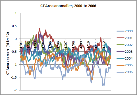
Because I use the average of the 1980s and 1990s as the baseline changes are harder to discern, however, as will become clear, after 2007 there is a marked change in nature.


The 1980s start higher, with the 1990s dropping, but for the period 2000 to 2006 there is a marked drop in anomalies as the overall decline in sea ice area starts to hit.
After 2007 the nature changes, with a far more aggressive loss of ice during the summer months, and in some years a further dip in anomalies as late season open water exists where in the past ice was strongly forming. Note also the marked dip in June, I'll get onto that at the end of this post.

Calculating the average anomalies for each period shows the change particularly, again the 1980s and 1990s being the period of baseline average show opposing behaviour, the 2000s drop, but after 2007 a new seasonal cycle emerges, we have a new Arctic ice pack. It was walking like a duck, flapping like a duck, quacking like a duck, now it is doing something altogether different, it is no longer a duck...

Now for NSIDC Extent.


The 1980s and 1990s behave pretty much like CT Area, and like CT Area the anomalies show a marked drop in the 2000s.

In the aftermath of 2007 again we have a whole new beast behaving in a very different manner.

Needless to say, the decadal averages show the same change of behaviour.

I plough through so much data and read so many papers it's easy to take all this for granted, when I step back like this it really is remarkable! Who'd have thought back in the 1980s, 1990s, or even the early 2000s that one year would usher in such a change? Anyway, as a warning what is happening in the Arctic is about as strong an early warning as any intelligent person could wish for and heed.
As a fan of Douglas Adams' Hitch-hikers' Guide To The Galaxy, I often see our predicament in terms of his wry humour. The image I have is of someone with their finger firmly pressing a button with a red sign lit above it reading "Do Not Press This Button", the blackest part of the joke being that pressing the button is humanity's one and only plan, while daubing some token greenwash around the place. Now I'm reminded of most characters from Idiocracy, I'd better quit before I digress too far.
What of this season? Let's just wind back now to the post 2007 period for CT Area and NSIDC Extent.

In both it's clear that in the case of several of those years we're close to the edge of what could be a remarkable aggressive melt. Initially I'll be following this through June, and here are the two graphs I'll be updating in the weeks to come.


Personally I'm hoping for a really exciting season this year, 2013 was interesting but not exciting, I'm not convinced it will happen, my only prediction so far this year is rather broad, I'll be making my main prediction in terms of CT Area after 20 June. Anyway my prediction based on April PIOMAS volume within the Arctic Ocean is as follows:
NSIDC Extent September daily minimum between 4.4M and 3.3M km^2, with the likelihood towards the higher end.
CT Area September daily minimum between 2.9M and 2.2M km^2, with the likelihood towards the higher end.
3 comments:
>"As a fan of Douglas Adams' Hitch-hikers' Guide To The Galaxy, I often see our predicament in terms of his wry humour. The image I have is of someone with their finger firmly pressing a button with a red sign lit above it reading "Do Not Press This Button", the blackest part of the joke being that pressing the button is humanity's one and only plan, while daubing some token greenwash around the place."
Sure you are not confused with Doctor Who:
http://www.dailymotion.com/video/xm53t5_doctor-who-great-big-threatening-button_tech
No, it's Adams. When they steal Disaster Area's ship Arthur presses a button and a panel lights up saying 'Do Not Press This Button', or perhaps 'that' button.
Post a Comment