The ice edge within the Arctic at minimum and outside the Arctic at maximum are set by different regions at opposing times in the seasonal cycle, until recently the recession of the ice edge has been proceeding at very nearly the same rate, leading to only a small increase in annual range. 2007 changed that, as can be seen from Cryosphere Today, link, where 2007 is seen to usher in a step increase in the annual range.
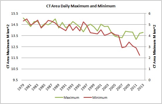
In the above graphic the green trace (annual daily maximum) is read on the left hand axis, the red trace (annual daily minimum) is read on the right hand axis. However both axes are 6M km^2 across, and are merely offset to match the earlier period. From this it can be seen that for much of the period both maximum and minimum follow each other relatively closely. In other words whatever was causing the reduction in area in March and September it seemed to be applying equally to regions geographically remote and removed in time by 6 months. The most reasonable cause of this, backed up by other reasoning, is that Anthropogenic Global Warming has been causing the loss, to argue for separate processes makes things get rather complicated very quickly. This period of decline of sea ice also covers a period of substantial volume loss, September lost 7,800 cubic kilometres of sea ice from 1979 to 2006.
However since the 1990s and to a far more marked degree since 2007 the two plots have diverged markedly. This is the Summer Acceleration.
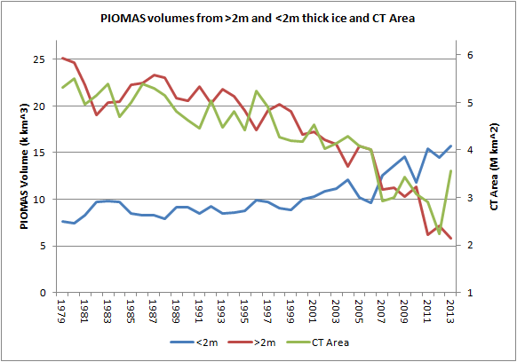
Using the data I've previously calculated I have broken down the April PIOMAS volume into the volume contribution from grid box cells with an effective thickness of less than 2m thick, and the volume contribution from those cells whose effective thickness is more than 2m thick. April is chosen as the peak volume month, a 2m thick demarcation is chosen because ice thinner than 2m thick is typically thermodynamically grown first year ice and that over 2m thick is typically mechanically thickened multi-year ice. The graph covers 1978 to 2012 (now updated to 2013).
It can be seen that while ice under 2m thick has remained the same (growing in recent years), the volume decrease is from ice over 2m thick. Furthermore when the declining ice over 2m thick is superimposed over a plot of daily minimum in CT Area, they match reasonably closely. I don't think this is accidental.
The peripheral seas outside the Arctic Ocean are where the sea ice maximum is set, during the period of the above graph they have always been seasonal, with no surviving multi-year ice, so their ice falls into the under 2m thick ice category. So whilst it may seem odd that ice volume in April would relate closely to conditions 5 months later within the Arctic, it is not odd at all because the ice over 2m thick is all within the Arctic Ocean. The loss of thicker ice has been directly impacting the initial conditions for seasonal melt within the Arctic Ocean.
So it seems that volume in April is driving the loss of area in September. I don't think the reverse is true, because volume has been declining from the thickest ice, away from the ice edge. This is shown by the decline from ice over 2m thick, not from the first year ice (2m thick and under) that would form after the September minimum in the periphery of the pack (around the coasts of the Arctic Ocean). Furthermore as can be seen in recent years, with the increase in volume from ice less than 2m thick; thin ice is able to 'bounce back' from perturbations, which is a strong negative feedback (e.g. Tietsche et al, Bitz & Roe). Whereas having a longer persistence (being many years old) thicker older ice has more of a 'memory' of impacts, hence carries forward the forcing of anthropogenic warming.
Volume loss drives thickness loss because volume loss represents thinning, and as I've discussed previously thinning increases open water formation efficiency, link. This can be appreciated using the same approach as figure 2 of Keen et al, 2013, "A Case Study of a Modelled Episode of Low Arctic Sea Ice." However I have calculated the following graphic from gridded PIOMAS data, link.

The grey plots are for all years 1978 to 2012, lighter greys for more recent years, darker for earlier. Red is the average of that full period, green is the post 2007 average, blue is the average for 2010 to 2012. The large swings for some years of thicker ice are due to transport of thicker ice in those years, leading to open water.
Going along the horizontal axis are thicknesses of PIOMAS modelled sea ice in April, these are broken down into 5cm bands, then for each band I calculate the percentage of ice in that thickness band that melts out to give open water in September, this percentage is given in the vertical axis. It is perhaps easiest to understand if I take a simple case where all the ice is only one thickness and use the red line as the long term average.
If we had an ice pack that was uniformly 3.5m thick then using the graph, finding the 3.5m increment on the horizontal axis, we can go across from there to find that we'd expect about 7% of the pack to melt out to open water by the end of the melt season in September. Now if we thin this imaginary ice pack to 2.5m thick we can use the red line to scan across and see that about 12% would melt out by September. But if we thin this pack by just 1m more, to 1.5m, now a massive 80% of the ice area melts out by September.
I have used gridded PIOMAS data to calculate the average thickness of the April ice pack north of 70degN, this is to bias the result in favour of conditions within the Arctic Ocean.
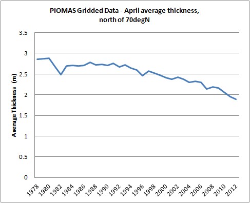
With average ice thickness dropping to below 2m we are now firmly in the region where the percentage melt increases rapidly, and non linearly, with further reductions in April grid box thickness. What this means is that we can expect strong volatility in the sea ice in the years to come, and without some stabilisation of the April thickness we will see this volatility manifesting itself as a succession of crashes in area and volume.
Whether or not we face a rapid transition still bothers me. I haven't changed my opinion back to being sceptical of a rapid transition, but I may still do so dependent on events. However I don't think the case for it is much more persuasive than the case against.
The decline in volume has hit a critical phase, where compared with past decades virtually all the MYI volume has been eliminated from the Arctic Ocean. Will we see autumn ice growth stabilise the pack, or will further declines in volume cause such winter thinning that we will see a virtually sea ice free state in the pack within years? I don't know.
Because area and extent are readily obtained from satellite data public attention tends to be focused on these metrics. However the acceleration of the summer decline in area and extent is a result of the decline in volume.
No comments:
Post a Comment