In recent summers the late summer volume loss in PIOMAS has been less than in the past, why is this?
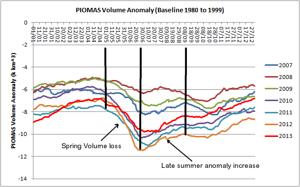
Volume anomalies are, as usual, calculated against the baseline average for 1980 to 1999. The plot below shows how since 2010 there has been an aggressive spring volume loss, but this has been followed by a relaxation, as anomalies rise. This is because, after late June, volume losses in late summer have been less than the average.
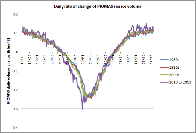
Calculating the daily change of volume (rate of change), the current date's volume minus the previous date's volume, shows the spring volume loss that is so notable in the above graph after 2010. The purple plot of rate of change is more negative than in previous decades. However after late June, the rate of change for the period after 2010 rises above the averages for the previous decades, demonstrating a lesser rate of loss.
Both Chris Randles (a fellow amateur) and Dr Jinlun Zhang (the main scientist behind PIOMAS) have suggested that this late summer reduction in losses is probably due to there being less ice to melt. This has seemed reasonable but I've never looked into it.
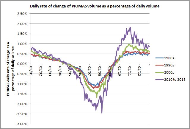
I've re-framed the above graph by expressing the daily rate of change as a percentage of the total volume on each data.
The above graph shows that when expressed in terms of the overall daily volume, the late summer shows more loss than the average for previous decades. In other words, the late summer decline in volume loss seems to have disappeared.
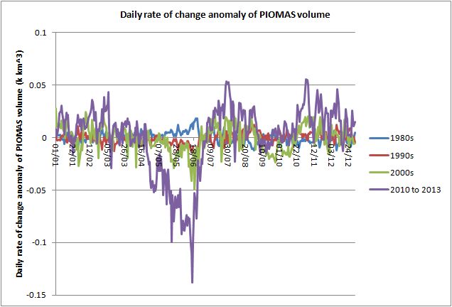
However the original observation was in terms of anomalies from the 1980 to 1999 mean. So I've recalculated the above graphs as anomalies in terms of the 1980 to 1990 average of rate of change.
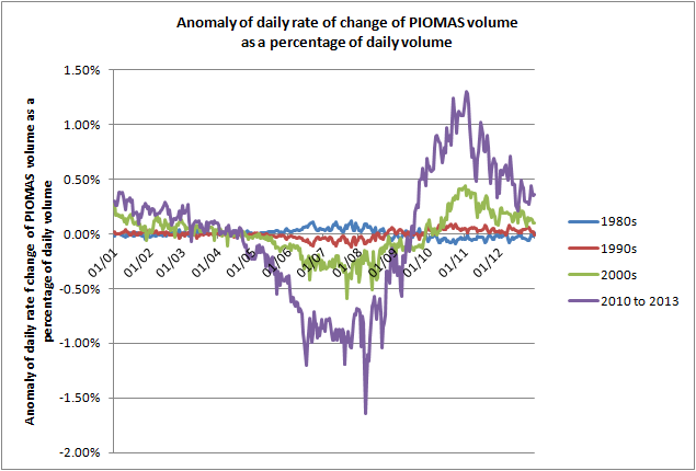
The anomaly of daily rate of change shows that the post 2010 average displays the behaviour implied by the top graph of this post: During spring volume loss rates are much greater (more negative) than the baseline 1980 to 1999 average. However there is a sudden shift to positive anomalies as the rates of change turn positive, this shows that in late summer the anomaly of rate of loss is positive, relative to the baseline, losses in late summer are reduced, which results in the increase in anomalies seen in the first graphic of this post.
However, as is to be expected from the preceding, if I express the anomalies of the rate of change as a percentage of daily volume, rates of change remain remarkably low relative to the baseline period (1980 to 1999) and to previous decades. Note the higher early freeze season rates of ice gain, due to lower volume fostering proportionately greater ice growth - the ice still grows to fill the Arctic Ocean.
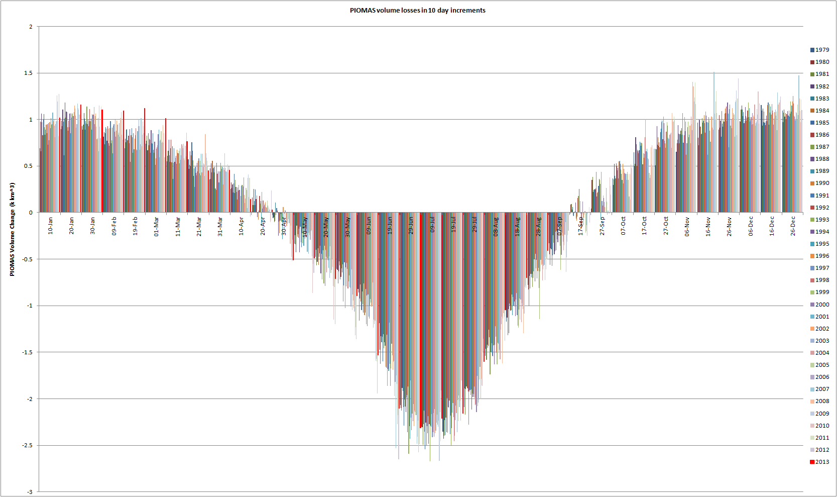
So it seems to me that the hunch of both Chris Randles and Dr Zhang is correct: the late summer anomaly increase in PIOMAS does seem to be due to there being less ice to melt. Late summer melt may reach a period where the 'law of diminishing returns' applies to ice melt late in the season as the ice retreats to the northern coast of Greenland and the Canadian Arctic Archipelago. The spring volume loss ends at the time of maximum volume loss (maximum insolation), as shown in this graphic:
This suggests to me that the spring volume loss is due to anomalous pre-conditioning, after which the ice is already 'conditioned' for melt and further gains in loss do not happen, rather losses in absolute terms are lower than average because there is less ice to melt. It is only when one factors in the total volume available from which to melt ice that losses are seen to be a greater percentage of the available volume than in the past. With respect to the above graphic, note how the post peak volume losses show a downwards trend.
It is worth bearing in mind that despite the poor weather for ice melt in 2013, the same pattern as in other post 2010 years has persisted. This suggests that ice dynamics are the prime mover during the summer following the 2010 volume loss.
15 comments:
A tangential thought: the temperature curve at http://ocean.dmi.dk/arctic/meant80n.uk.php which shows the temperature above 80th northern parallel shows that most often the temperature is above average for the latest years. I assume that the area under the anomaly would show excess energy with respect to the "steady state" average, and would precondition the ice for melting with less effort when the melting season starts.
My thought is then than that this excess energy may contribute to the spring melt, and by eyeball inspection of 2014 it would appear that there is lots of excess energy, and it would be interesting if there is a correlation with excess energy in winter and spring melt.
Hi PLG,
You've got to be cautious with regards cause and effect here. During summer melting ice pegs temperatures to near freezing point (~0degC), so increases of temperature above that are probably in large part due to greater open water - open water which can warm to above zero degC.
For 2014 so far temperatures have been higher. But I don't think this can be interpreted as excess energy available for melt because temperatures are so far below zero. I've plotted NCEP/NCAR temperatures north of 80degN - to be comparable to the DMI data you post, see here. You'll see that there's a large red anomaly (+14degC!) in the top left, this is the Atlantic edge of the pack. Because the pack edge is much further back than usual in that region it's exposing ocean (a few deg C) where normally there would be cold (around -10 to -30 degC typical). So I suspect that the warming DMI shows is due to the ice edge being unusually far back, and does not represent energy available for ice melt.
The question that arises is whether the pack is thickening less - if there's less ice going into the melt season then this represents less of an energy drain (ice melt takes energy) going into the next season. I'm not convinced that the picture from the DMI plots supports the idea of less thickening due to warmer temperatures. Temperatures over much of the pack are only 2 to 6degC above climatology, this is typical for recent years. And the pack will continue to thicken within the Arctic Ocean until April / May.
I wasn't thinking clearly. My initial thought was that if the ice is warmer it will melt faster in spring, however, to warm 1 kg of ice 2.1 kJ/K is required while melting a kg requires 334 kJ. So starting with e.g. ice at -10C will require 334+10*2.1, while starting at -1C requires 334+2.1.
Clearly, the temperature of the ice is relatively unimportant. I was also thinking of warming the ice from the underside (warmer water), but that also is relatively unimportant as long as the ice does not melt.
My mistake.
No problem, you're not alone in having supposed that warmer ice could be a factor, but as you've shown it's not a significant one. This has been pointed out recently to someone else whose opinion I (still) respect.
Hey - I resemble that comment :)
And I'll have to reiterate that while ice temperature may not seem significant compared to the energy required to melt the ice - using plg's numbers we're talking a 5% difference in energy requirements.
It's important to keep in mind the relative scale of the changes were witnessing. For instance, a 50% reduction over a ten-year period is approximately 4% annually.
Meanwhile, a 2ºC increase in global temperature *only* represents a 0.7% increase in energy (using 15ºC as a baseline). We sometimes fail to realize how small of an energy window we live in.
OK Kevin it was you...
Fair points, but the warming we're talking about is surely early melt season. And if you look at the plot of volume change in ten day increments (last plot in the main post) the early season is a small factor. By June there's extensive melt ponding, so by then most of the ice seems to have warmed enough for surface melting and liquid water.
Chris -- "... but the warming we're talking about is surely early melt season...."
Well, the temperatures under discussion are the 80N DMI averages. So this would have an effect when ice located above 80N either melts in situ or has been transported outside of the 80N region.
I doubt that we are talking specifically about early season losses - early season losses would likely be in the peripheral seas and not in the 80N region. What we should see is losses at and above 80N beginning consistently earlier in the calendar year. This would be consistent with northern hemisphere lakes ice-off data.
Sorry, I should have been more clear - by early season I'm talking about the warming from May to June which results in extensive melt ponding from early June. Thickening still occurs in the Arctic Ocean up to May.
The volume losses after this period are substantial. Furthermore, the June Cliff in CT Area seems to me to be happening after 2010. I assume that this is because of increased areas of relatively flat FYI becoming much more prevalent in recent years.
I wouldn't be so quick to conclude ice temperature is not a significant effect. The warmer the ice, the sooner the SNOW on top of the ice can start melting, thus reducing the albedo of the ice itself, in the part of the season where that is critical (June!).
So, despite the ice itself taking so much more energy to melt than to warm,
It's the snow! It's the snow!
I would also think it's more relevant what the volume loss per extent/area is than volume loss per volume, since ice melts at the top and bottom rather than the interior, volume loss that occurs by thinning without a corresponding loss in area or extent should NOT reduce the availability of ice for melting, until that thickness reaches zero.
Nightvid,
The average period is 1980 to 1999, the rise in anomalies following the post 2010 spring melts is a rise relative to that average period. During the average period there was more volume and area available from which to melt so the melt in late summer was greater than in recent years.
As for whether area or thickness is more important. The PIOMAS volume loss of 2010 impacted thickness more than area as it happened early in the spring and over early summer. The increase in late summer anomalies happens most strongly after the spring melts following 2010. This suggests that area is not the key issue here, rather that thinner ice is. Although the thinner ice is mainly across the central Arctic. Post 2010 thinning in April over the peripheral seas (Beaufort to Kara) is not as large as in the central Arctic, if I recall correctly.
Not sure I follow, Chris. The extent of the ice in July, the critical time for the anomaly increase, was very low in 2010, 2011, and 2012. Not so in 2008 or 2009, or 2013 for that matter. 2013's Volume anomaly increase in late July and early August can be explained by Arctic overcast and delayed snow melt which didn't occur in most of the CAB until around July 10th or so. That leaves 2010-2012 with those Volume anomaly increases, which seems perfectly explicable as a result of the low July extent, with no volume needing to even be brought into the discussion as a cause. What am I missing?
I don't think it can be attacked piecemeal, despite the weather 2013 still showed the same spring crash and late summer lower loss of volume, when compared to the past. Thus it joined 2010, 2011 and 2012, despite the weather! This indicates that what we'e seeing is ice dynamics after the 2010 event, not weather.
2010's extent was not anomalously low in August, 2008 was actually lower. And I have to put you back to the simple fact the the change in the seasonal cycle has happened since 2010, a massive volume loss.
Lower volume implies lower thickness which implies greater ease with which open water can be exposed.
BTW - PIOMAS daily gridded data has been released, so I may not be prompt in replying.
Nightvid,
I've cracked the problem I was working on and have had time to think.
Your point with regards area is valid. But what brought about the shift was the 2010 volume loss, leading to aggressive spring melts and an accompanying late summer melt that is less than the average for late summer 1980 to 1999.
But I still don't think area/extent is the only issue, because of August 2008 having lower extent than 2010 but it didn't show the same behaviour, in fact in August 2008 melt was greater than average (falling anomalies). But I can't think of a way to cleanly cut through whether thinner ice (less volume) or smaller area is key.
Nightvid,
I still can't think of a way to cut through whether area or volume or both is the key factor, but here's a graph of the rate of change of volume as a percentage of daily CT Area. See here
Working as a % of area removes the late summer anomaly increase - rates of change are now all similar, and the post 2010 rate of change is not less than previous decades (as in the second graphic of the main post). The comparable treatment (as a % of volume) is the third graphic of the main post.
This would seem to support your contention.
Post a Comment