The following graphic shows the difference between PIOMAS V2.0 and V2.1 as a percentage of volume in the month and year stated, while this is shown to be large it only applies to recent years and turns out to have little effect on the changes seen in PIOMAS in recent years.

After improving upon the calculations of grid box areas using the Zhang method I was left with the following annoying and puzzling anomaly around 2010. I was unable to get to the bottom of why there was this disagreement between volume I calculated using the gridded data and the monthly PIOMAS timeseries. I contacted Dr Zhang, he didn't know why it was happening, so I was left puzzled, sure it was something I'd done, but totally unable to figure out why.
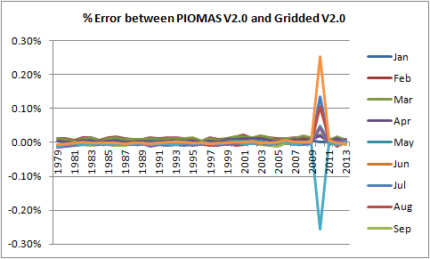
It turns out that the above anomaly was probably due to the bug discovered in the PIOMAS model, because when I run the same calculation of volume using V2.1 and compare to V2.1 the above anomaly disappears.
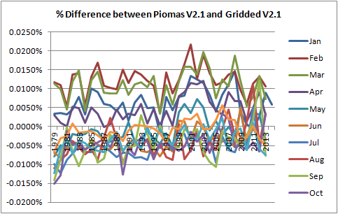
Note the massive drop in percentage error that V2.1 affords. These remaining errors are something I've concluded I just have to live with, but when compared with the stated uncertainty found by Schweiger et al (2011) I consider that those errors are negligble. When someone is able to reduce them further I'll change my method, as of now I'm not minded to spend more time trying to reduce them further. My method of grid cell area calculation is explained here.
To close the circle I've calculated the error between the main series monthly volume for PIOMAS V2.0 and my gridded volume calculations using V2.1.

This graph is virtually identical to the first graph of this post, which compares the main series monthly volume for PIOMAS V2.0 and V2.1. Taking the numbers behind those two graphs, the differences between the two sets of numbers (Jan 1979 to Dec 2013) have been calculated, the average is -0.00048%, the standard deviation is 0.00715%. The difference between PIOMAS V2.1 monthly volume and my calculation using gridded V2.1 does show some seasonality in my error, peaking in late winter. But as I said above, I consider this acceptable.
There are significant absolute volume differences on a regional basis, which I've calculated for April and September, months of maximum and minimum volumes respectively.
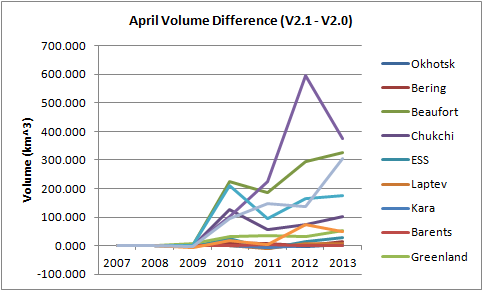
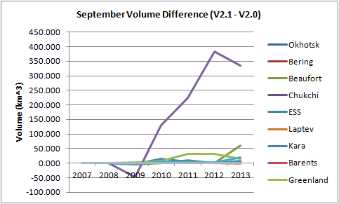
The PIOMAS webpage states that "Ice thickness is generally greater in the Beaufort Chukchi Sea area with the largest differences in thickness during May. Differences in ice volume are up to 11% greater in late spring." The above graphs show that by the end of the freeze season the volume difference between the two versions is indeed greatest in Beaufort and Chukchi, with Hudson (light blue) and the CAA (bright blue) also being high. I've just realised I should have extended those graphs down, some of the legend is missed off (Doh!). By the end of the melt season in September it is the Central Arctic that shows the greatest volume increase for the change from V2.0 to V2.1.
This does affect detailed calculations such as the difference between January 2013 and 2014, as used in my previous post. I originally posted this graph, which used V2.1 for January 2014, but V2.0 for January 2013.

Now that has changed with the full V2.1 update.
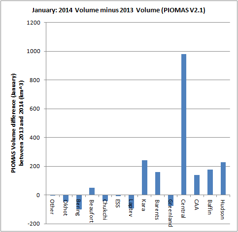
The qualitative picture remains the same, apart from in Beaufort, which can be anticipated from the regional changes between V2.0 and V2.1.
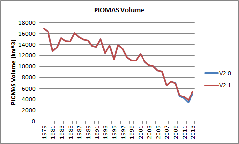
However the version change impacts overall volume very little. Note that all the following graphs are plotted using the full dataset from 1979 to 2013.
And the record of interannual differences in September volume shows how little impact there has been.
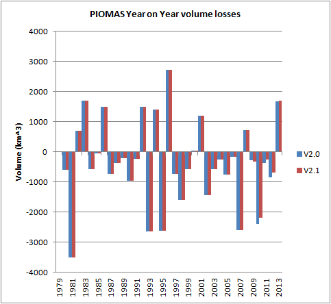
Data prior to 2009 is, of course, unchanged. But the 2010 volume loss is still seen as an event as significant as 2007, and when one recalculates the above by scaling to annual volume 2007 and 2010 stand out as highly anomalous events.
The issue of 2010 was something that concerned me when I was first aware of the gridded data changing. I've claimed that the 2010 volume loss and following spring melt increases are very important, an event and consequences. When I realised that the data change was from 2009 my first thought was that they'd removed the anomalous spring melt and 2010 volume loss I claim has caused that, in other words I'd been assigning importance to an artefact of a software bug.
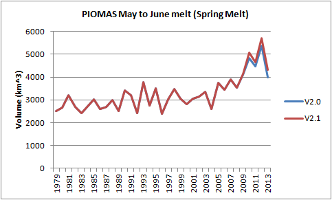
However the spring melt is seen to be marginally greater in the new version of PIOMAS.
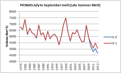
And the following decline in late summer melt is seen to be less in the new version.
So the new version does not detrimentally affect my claims about the 2010 volume loss and increased spring melt.
This change is minor but necessary, and it's good to see the 2010 difference between gridded volume and the main volume series removed. It doesn't change the main message from PIOMAS, that sea ice volume is on a long term downward trajectory. Eyeballing the data I had wondered how it would affect the 'extrapolation to zero' date at which no ice is 'predicted'. That's something I've been critical of in the past, so it's not something I do. But Wipneus, who is aware of the caveats associated with this practice, has calculated the impact date of zero crossing of the move to PIOMAS 2.1, he finds the zero crossing moves forward half a year from 2016.44 to 2016.94, in other words; even that impact is negligible.
I've now updated the PIOMAS regional data which is derived from the gridded dataset, see this page for links to CSV files. I've also updated the sea ice dataset spreadsheet which I have made public, it's for Excel 2007 and later, and contains CT Area, NSIDC Extent, and PIOMAS in matching year/day tables with a sheet of monthly averages including calculated thickness. That spreadsheet is available here.
3 comments:
July to Sept melt falling that much from 1979 to 1996 without similar rise in May June melt confused me.
So I created this graph:
http://farm4.staticflickr.com/3832/12396645665_9c4dc90817_o.png
Nice post :)
Did you inform the Piomas team of that 2010 discrepancy and was the bug found through that or is it just incidental that that issue has been fixed?
The April to May melt nearly triples while May June melt hasn't really doubled. So perhaps April to June is a better split?
Thanks Crandles,
I chose to use May to June losses as a conservative indicator of the spring melt. It's best shown in daily data anomalies where it runs from early May to the 21st June. But thanks for that graph April to June would likely be better, in that sense one could view the averages for each month as running from the end of the month.
I posted the new area calculation based data in early December, so I was in touch with Dr Zhang about the 2010 blip shortly before then. I don't know if that is what led to the discovery of the bug, but it seems a reasonable thing to suspect.
Post a Comment