I have taken MODIS box R04C04, link, days 177 to 180, 250m resolution band 3-6-7, placed as layers in an image editor and I have erased regions in each layer to reveal as much ice as possible. This is relying on the slower movement of sea ice as compared to the more rapid movement of clouds, which prevent viewing of the ice. The resultant image has then been scaled down, and tone adjusted to bring out the contrast between ice and water, even under the cloud that could not be removed by compositing a series of days.
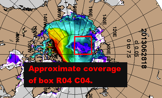
The US Navy HYCOM model, link, output for 28 June 2013 has been rotated to match the Greenwich meridian a box is overlayed to give the approximate location of box R04C04 in MODIS.
This shows the region of thin ice which is associated with a reduction in concentration, link. Although there will have been thinning of the ice in this area, that is not necessarily needed to explain the thinning. Thinning would occur with a drop in concentration as the more water in a given model grid box, the lower the average thickness in that grid box.

In common with the HYCOM model output there is a large region of very low concentration across much of box R04C04, this is feasibly down to the order of 50% as in the model. At the top of the box there is however an increase in concentration (less open water), toward the pole (bottom left) concentration seems to increase, as it does to the bottom right. This is a reasonably good match for the HYCOM model output in the top image.
This region has been developing all month initially caused by a low pressure system, I've shared reasonable doubt with others that it might not develop as the model projected. In fact it has, and the model output seems to reasonably reproduce the observed state of the ice. Model forecasts show this feature persisting and consolidating. I see no reason to doubt that.
Will we see a massive hole in the pack by August? It seems feasible. But this year is turning out to be so weird I don't want to commit myself on anything.
2 comments:
Chris - I made another comment on your previous post, but it didn't get through. It applies to this post as well. Go look at NCEP/NCAR for MAM 2012 compared to this year. Then try to reconcile NCEP/NCAR with DMI N80 temps.
I still think DMI is either just flat out wrong or telling us a story we don't yet understand.
Kevin,
Here's a graphic that should help. The purple trace is hue adjusted DMI trace for 2012, the red trace is for 2013. Red infill indicates 2013 below 2012, blue infill indicates 2013 above 2012.
LINK
Month demarcations are estimated.
There's also a table of NCEP/NCAR north of 80degN (area weighted). And difference between 2013 and 2012, following the same red/blue key as above.
DMI uses ERA40, so will differ a bit from NCEP/NCAR and when comparing years any differences will be accentuated. There does seem to be an arguable qualitative agreement, in March there look to be equal amounts of blue and red infill, yet NCEP/NCAR shows 2013 markedly warmer. However by the same reasoning April and May seem to agree.
PS, the cold snap in February 2013 seems to be captured OK by both reanalyses - i.e. they seem to agree, using judgement by eye.
Is it these sort of disagreements you're referring to?
Post a Comment