Around 1975 the signal of AW arose from the noise of natural climatic varability. Since then we've seen a persistent linear increase of the order of 0.2degC per decade, a trend that has not abated. I've recently been stating in the comments at RealClimate that I'm not convinced that we're seeing the occurrence of weather disasters rise from the background of natural variability, not in the same way that global warming has. Due to a couple of the replies I've had there, a recent post by Stefan Rahmstorf, and a new paper by James Hansen and colleagues I think I now have enough to make up my mind on one aspect of weather related disasters - those related directly to temperature, as opposed to hydrometeorological events (floods, wet landslides, heavy rain, drought etc.)
One of the most convincing and alarming papers I was directed to was by Barriopedro et al, but this post will be long enough so I'll save that for a follow up post. Then Stefan Rahmstorf posted at RealClimate in relation to a paper he co-authored (Rahmstorf & Coumou) about the statistical characteristics of record events in a warming climate. Now there's a new paper out by James Hansen and colleagues, they examine the impact of warming on the statistical distribution of temperature. Hansen has previously used the analaogy of a dice to illustrate the issue, for 1951 to 1980 the climate could be represented as a dice with two sides hotter than average, two cooler, and two around average. Currently Hansen asserts the dice is loaded; four sides hot, and one side each for cool and average (relative to the 1980-1951 baseline). But before I start to discuss their paper I want to go over some basic theory needed to understand one of the other findings. A finding which I find shocking.
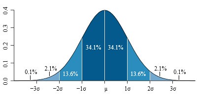
The standard deviation is a statistical measure of how far data deviates from the mean. A small standard deviation means that most of the data points are close to the mean, a large standard deviation means the data points are spread out with most being far from the mean. In terms of climate data such as temperature the temperature is said to have a 'normal' distribution such as in the graph below.
In normally distributed data such as a temperature series for a region or globally there is a relationship between the standard deviation and how often temperatures occur with respect to the standard distribution. For example, from the above graph, temperatures between +/-1 standard deviations occur for 68.2% of the time (34.1 + 34.1), in real data you'll never get to exactly 68.2% but it'll be in that ball-park. Likewise temperatures between +/- 1 to 2 standard deviations happen for 27.2% of the time and +/- 2 to 3 is 4.2%. In other words more extreme temperature deviations, be they warm or cold deviations are less likely than smaller deviations.
The theory is that Global Warming should in time increase the incidence of extreme warm events. Because the overall picture is one of warming, affecting the cold and warm side of variation, this should manifest itself in the normal distribution moving to one side. Because warmer deviations are typically shown to the right, and colder to the left this movement is to the right.
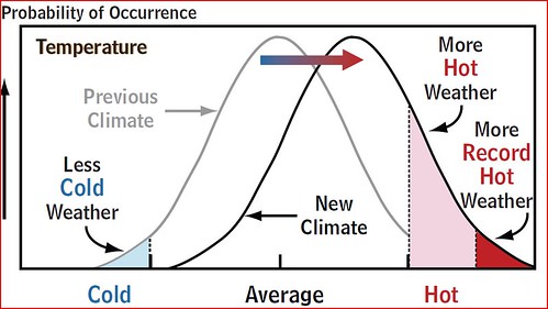
Figure 1 from Karl et al, showing the change of the normal distribution expected in a warming world.
The above figure shows this theoretical movement of the distribution of temperatures. As the planet warms the instances of hot weather increase more than one might suppose from the relatively small movement that a global warming of 0.6degC (globally since 1975) or 0.8degC (Nothern Hemisphere land since 1975) might seem to imply. This increase in hot weather is shown by the area between the grey curve (pre-existing climate) and the black curve).
Hansen et al find that this movement is already happening and is supported by observations.
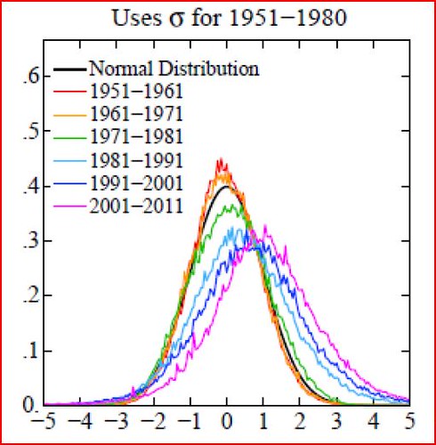
Hansen et al, figure 4, summer (Jun-Jul-Aug) distribution.

Hansen et al, figure 4, winter (Dec-Jan-Feb) distribution.
In the above graphs the vertical axis is the normalised (i.e. 1 corresponds to all the years in the dataset) occurence of temperatures which are plotted along the horizontal axis. Both of these use the standard deviation (sigma) for the 1951 to 1980, I consider this the best case to reproduce here as the main issue of concern is the change with time, so in choosing these I'm preferring an earlier baseline, '51 to '80. Other cases are presented in the paper, they are not substantially different.
What is so striking here is that for each successive decade from the 1970s the curves have flattened as the upper end has smeared out, giving more high temperature anomalies. The pattern is clear and shocking. In figure 6 and associated text they point out that over the last 30 years the areas covered by warm temperature extremes of over 3 standard deviations has increased to around 10% of the land area, a tenfold increase. This is worrying in view of the findings of Dai and other researchers with regards model projections of future aridity. Indeed with the drying of the Mediterranean (NOAA) we seem already to be seeing the onset of the drought pattern shown by models.

Modeled
As I have already discussed we have evidence of the dangerous role warming can play in the intensification of droughts driven by natural processes. I've been sceptical of claims that we face a drought driven catastrophe in the continental interiors in the coming decades, now I'm starting to be rather concerned. In the previous post I outlined the danger of prevarication - if we decide to leave it until things get bad to reduce emissions of fossil fuels it will be too late to avoid further worsening.
When I was still sceptical of (in denial about) AGW I saw the film "The Day After Tomorrow." Its scientific faults were hardly worth dwelling on - what does one expect from Hollywood, it's entertainment not education. What was more interesting to me was on DVD disc 2. As a sceptic I doubted the veracity of the following quote, now I'm not so sure:
Changing the temperature of the Earth changes all climates, it warms the centre of the continents, for instance, which when warmed dry out. And we're watching at the moment the drying out of Central Asia, we have a big drought in Arizona, elsewhere, and everyone has noticed that the forests of North America are burning, they're burning because it's warmer and drier... ...The same thing is happening all across Asia, I'm told that 13 million hectares of forests in Russia Burned this past summer. These are big serious problems. The climatic disruption has the potential for literally burning civilisation off the Earth in the course of the next decades.George Woodwell founder and director of the Woods Hole Research Centre. The Science of Tomorrow: Disc 2 of The Day After Tomorrow (2004) DVD.
I usually take the line that "I don't know" when asked about what AGW means for the future. Now I still feel reticent to say that it's looking really bad, but I can't think of a rational reason why.
Tonight I'm wondering if my 'climate-moderate' stance is stupid and cowardly.
One final issue: The question may arise: Why am I ignoring the recent cold winters? I am not, they are simply not directly relevant. I've recently discussed two reasons to expect colder winters in future. There is evidence to show that low solar activity, in particular UV levels, may cause more cold winters, discussed here. There is also evidence to show that the loss of Arctic sea-ice may cause more cold winters, discussed here. And even though those two factors may bias towards colder winters, the 2009/10 winter may have been caused by Siberian snowfall, discussed here. So it seems likely that processes apart from the warming trend may have a role in the recent winters. Furthermore Cattiaux et al examine the 2009/10 winter in comparison to previous cold winter episodes. They use measures of air flow and find that 2009/10 was most like the extremely cold winter of 1963, however it was not as cold. They conclude that this was because of the trend of global warming in the intervening time between 1963 and 2009/10 due to the radiative consequences of increased greenhouse gas concentrations. So not only are the cold winters not directly relevant to the global warming trend but 2009/10's winter was less severe than it would have been without global warming.
Cattiaux et al, 2010, "Winter 2010 in Europe: A cold extreme in a warming climate."
http://www.lmd.jussieu.fr/~fcodron/ARTICLES/Cattiaux2010.pdf
Dai, 2010, "Drought under global warming: A review"
http://www.cgd.ucar.edu/cas/adai/papers/Dai-drought_WIRES2010.pdf
Hansen et al, 2011, "Climate Variability and Climate Change: The New Climate Dice."
http://www.columbia.edu/~jeh1/mailings/2011/20111110_NewClimateDice.pdf
Karl et al, 2008, "Weather and Climate Extremes in a Changing Climate."
http://www.climatescience.gov/Library/sap/sap3-3/final-report/
Rahmstorf & Coumou, 2011, "Increase of extreme events in a warming world."
http://www.pnas.org/content/108/44/17905.abstract
7 comments:
Chris R - it does not appear this is a peer-reviewed paper. Hansen calls it a 'communication'.
I grew up in the Dakotas and now live in Texas. The farmland in much of the Dakotas now has the highest groundwater in my lifetime, and in Texas I'm looking at dead trees that survived the multi-year 1950s drought, but not this one.
JCH,
Thanks, I'm aware that this isn't a peer-reviewed publication. However the processing involved is such that Hansen and colleagues are not likely to have got it wrong, and having read rather a lot of Hansen's work I trust his team to do a careful job.
Basically I'd been quietly sceptical of the claims about the risk of a global pattern of drought in the coming decades. I'm no longer sceptical.
Sorry to hear about Texas. If the models Dai cites are correct at least in broad pattern of drying things don't look good for the USA.
Good post. Very similar in sentiment to one of my own back at the start of the yesr;
http://lazarus-on.blogspot.com/2011/01/what-is-one-degree.html
I wish I had found the chart from Karl et al, which is much better that the graphics I did myself. Which paper is it actually from?
The important thing about ND curves is that they can be applied to many aspects beyond just temperature. Examples like seasonal changes, hatchings and blooming as well as specific weather events like precipitation amounts, number of tornadoes etc. Any forcings in these will show on a ND curve to indicate if and how much Hansen's 'dice' are being loaded. From the data, the trends now emerging from the noise seem to show that they are.
Thanks, I'm sure that was me in the comments back then.
The graphs you want are on page 17 (pdf pages) of the pdf file "Chapter 1 Why Weather and Climate Extremes Matter."
Check out figure 1.5 on the same page. 2003: Now that's what I call an outlier!
Oops - actually you want page 19.
Thanks for that.
I see the latest special report is out today from the IPCC that is expected to confirm the link between climate change and extreme weather.
http://www.guardian.co.uk/environment/2011/nov/17/ipcc-climate-change-extreme-weather?intcmp=122
Very interesting post, Chris! Would you be interested in sharing something similar in the form of a guest post at Skeptical Science?
If you are interested, just leave a message to my attention on any of the threads there & I'll get back to you.
Thanks!
Daniel Bailey
aka, The Yooper
Post a Comment